Employee Churn Analysis
Overview
Analyze employee churn. Find out why employees are leaving the company, and learn to predict who will leave the company
Employee turnover refers to the gradual loss of employees over a period of time. Acquiring new employees as a replacement has its costs such as hiring costs and training costs. Also, the new employee will take time to learn skills at the similar level of technical or business expertise knowledge of an older employee. Organizations tackle this problem by applying machine learning techniques to predict employee churn, which helps them in taking necessary actions.
Employee turnover (attrition) is a major cost to an organization, and predicting turnover is at the forefront of needs of Human Resources (HR) in many organizations.
In Research, it was found that employee churn will be affected by age, tenure, pay, job satisfaction, salary, working conditions, growth potential and employee’s perceptions of fairness. Some other variables such as age, gender, ethnicity, education, and marital status, were essential factors in the prediction of employee churn.
Attrition can happen for many reasons:
- Employees looking for better opportunities.
- A negative working environment.
- Bad management
- Sickness of an employee (or even death)
- Excessive working hours
Increasing customer retention rates could increase profits.
Structure of the Project:
Exploratory Data Analysis: One of the first things in my journey of Data Science, was to always know the story behind the data. What’s the point of implementing predictive algorithms if you don’t know what your data is about? My philosophy is to “drill down” the data until I find interesting insights that will give me a better understanding of my data.
Recommendations: What recommendations will I give the organization based on the analysis made with this data. How can the organization
reduce the rate of attritioninside the company? In my opinion, this is the most important part of the analysis because it gives us a better understanding of what the organization could do to avoid the negative effect of attrition.Modeling: Implement a predictive model to determine whether an employee is going to quit or not.
Exploratory Data Analysis
Exploratory Data Analysis is an initial process of analysis, in which you can summarize characteristics of data such as pattern, trends, outliers, and hypothesis testing using descriptive statistics and visualization.
Loading Dataset
Let’s first load the required HR dataset
# Load Data
path_train <- "data/telco_train.xlsx"
path_test <- "data/telco_test.xlsx"
path_data_definitions <- "data/telco_data_definitions.xlsx"

train_raw_tbl <- read_excel(path_train, sheet = 1)
test_raw_tbl <- read_excel(path_test, sheet = 1)
definitions_raw_tbl <- read_excel(path_data_definitions, sheet = 1, col_names = FALSE)

# Source Scripts ----
source("scripts/assess_attrition.R")

# Processing Pipeline -----------------------------------------------------
source("scripts/data_processing_pipeline.R")
train_readable_tbl <- process_hr_data_readable(train_raw_tbl, definitions_raw_tbl)
test_readable_tbl  <- process_hr_data_readable(test_raw_tbl, definitions_raw_tbl)

# Correlation Plots
source("scripts/plot_cor.R")
Description
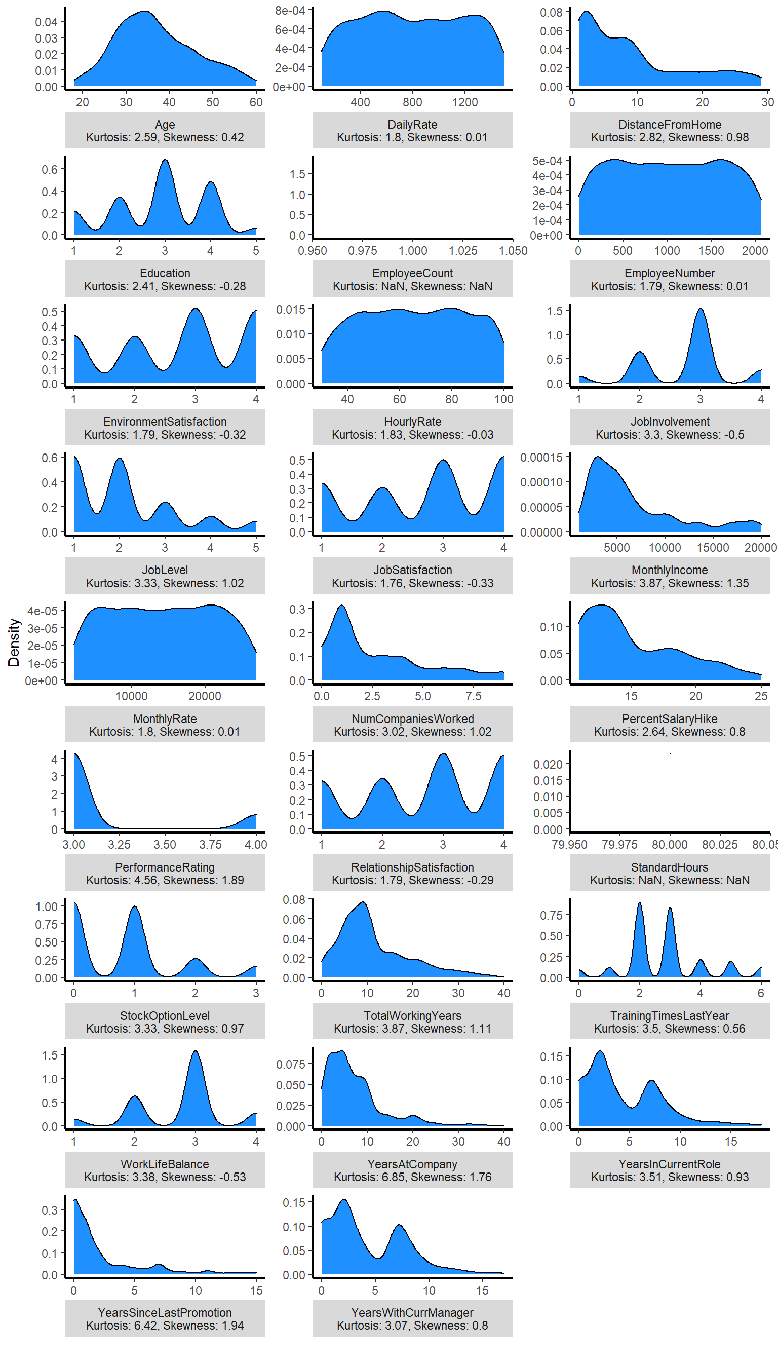
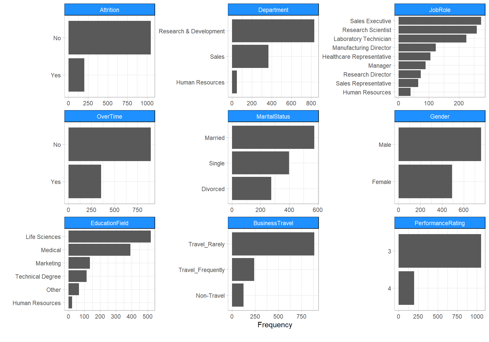
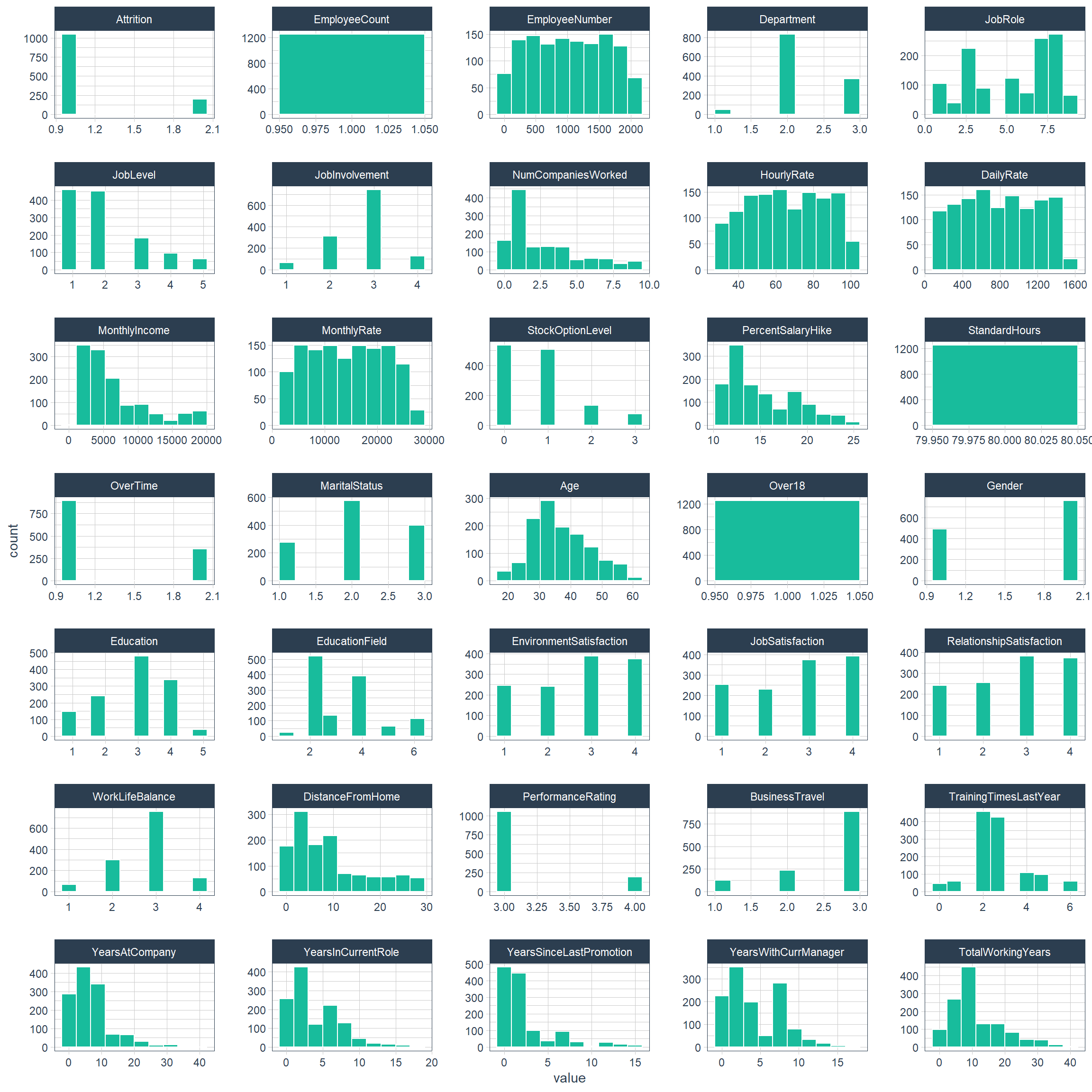
The variable names and class types are the same as above, with a total of 1,250 observations and 35 variables. A brief description of the variable follows.
| Variable name | Description |
|---|---|
| Age | Age of employee |
| Attrition | Attrition of employee (Yes, No) |
| BusinessTravel | Frequency of business travel (Non-Travel, Travel_Rarely, Travel_Frequently) |
| DailyRate | Amount of money a company has to pay employee to work for them for a day |
| Department | Part of an company that deals with a particular area of work(Research & Development, Sales, Human Resources) |
| DistanceFromHome | Distance between company and home |
| Education | Level of education (1: Below College, 2: College, 3: Bachelor, 4: Master, 5: Doctor) |
| EducationField | Field of Education (Life Sciences, Medical, Human Resources, Technical Degree, Marketing, Other) |
| EmployeeCount | Count of employee (always 1) |
| EmployeeNumber | Number of employee |
| EnvironmentSatisfaction | Satisfaction of environment (1: Low, 2: Medium, 3: High, 4: Very High) |
| HourlyRate | Amount of money a company has to pay employee to work for them for an hour |
| JobInvolvement | Level of job involvement (1: Low, 2: Medium, 3: High, 4: Very High) |
| JobLevel | Level of job (1~5) |
| JobRole | Role of job (Sales Executive, Research Scientist, Laboratory Technician, Manager, Healthcare Representative, Sales Representative, Manufacturing Director, Human Resources, Manager) |
| JobSatisfaction | Satisfaction of job (1: Low, 2: Medium, 3: High, 4: Very High) |
| MaritalStatus | Fact of employee being married or not (Married, Divorced, Single) |
| MonthlyIncome | Income of Month |
| MonthlyRate | Amount of money a company has to pay employee to work for them for a month |
| NumCompaniesWorked | Length of service |
| Over18 | Over 18 years old (Y, N) |
| OverTime | After the usual time needed or expected in a job (Yes, No) |
| PercentSalaryHike | Percent of salary of hike |
| PerformanceRating | Level of performance assessment (1: Low, 2: Good, 3: Excellent, 4: Outstanding) |
| RelationshipSatisfaction | Level of relationship satisfaction (1: Low, 2: Medium, 3: High, 4: Very High) |
| StandardHours | Standard work hours (always 80) |
| StockOptionLevel | Stock option level (0~3) |
| TotalWorkingYears | Years of total working |
| TrainingTimesLastYear | Training times of last year(C: Cherbourg, Q: Queenstown, S: Southampton) |
| WorkLifeBalance | Level of work life balance (1: Bad, 2: Good, 3: Better, 4: Best) |
| YearsAtCompany | Years at company |
| YearsInCurrentRole | Years in current role |
| YearsSinceLastPromotion | Years since last promotion |
| YearsWithCurrManager | Years with current manager |
Structure
How many columns and observations is there in our dataset?
The raw data contains 1,250 rows (customers) and 35 columns (features). The “Attrition” is the label in our dataset and we would like to find out why employees are leaving the organization!
We only have two datatypes in this dataset: factors and integers
Most features in this dataset are ordinal variables which are similar to categorical variables however, ordering of those variables matter. A lot of the variables in this dataset have a range from 1-4 or 1-5, The lower the ordinal variable, the worse it is in this case. For instance, Job Satisfaction 1 = “Low” while 4 = “Very High”.
After you have loaded the dataset, you might want to know a little bit more about it. You can check attributes names and datatypes.
Change all character data types to factors. This is needed for H2O. We could make a number of other numeric data that is actually categorical factors, but this tends to increase modeling time and can have little improvement on model performance.
## Rows: 1,250
## Columns: 35
## $ Age                      <dbl> 41, 49, 37, 33, 27, 32, 59, 30, 38, 36, 35...
## $ Attrition                <fct> Yes, No, Yes, No, No, No, No, No, No, No, ...
## $ BusinessTravel           <fct> Travel_Rarely, Travel_Frequently, Travel_R...
## $ DailyRate                <dbl> 1102, 279, 1373, 1392, 591, 1005, 1324, 13...
## $ Department               <fct> Sales, Research & Development, Research & ...
## $ DistanceFromHome         <dbl> 1, 8, 2, 3, 2, 2, 3, 24, 23, 27, 16, 15, 2...
## $ Education                <fct> College, Below College, College, Master, B...
## $ EducationField           <fct> Life Sciences, Life Sciences, Other, Life ...
## $ EmployeeCount            <dbl> 1, 1, 1, 1, 1, 1, 1, 1, 1, 1, 1, 1, 1, 1, ...
## $ EmployeeNumber           <dbl> 1, 2, 4, 5, 7, 8, 10, 11, 12, 13, 14, 15, ...
## $ EnvironmentSatisfaction  <fct> Medium, High, Very High, Very High, Low, V...
## $ Gender                   <fct> Female, Male, Male, Female, Male, Male, Fe...
## $ HourlyRate               <dbl> 94, 61, 92, 56, 40, 79, 81, 67, 44, 94, 84...
## $ JobInvolvement           <fct> High, Medium, Medium, High, High, High, Ve...
## $ JobLevel                 <dbl> 2, 2, 1, 1, 1, 1, 1, 1, 3, 2, 1, 2, 1, 1, ...
## $ JobRole                  <fct> Sales Executive, Research Scientist, Labor...
## $ JobSatisfaction          <fct> Very High, Medium, High, High, Medium, Ver...
## $ MaritalStatus            <fct> Single, Married, Single, Married, Married,...
## $ MonthlyIncome            <dbl> 5993, 5130, 2090, 2909, 3468, 3068, 2670, ...
## $ MonthlyRate              <dbl> 19479, 24907, 2396, 23159, 16632, 11864, 9...
## $ NumCompaniesWorked       <dbl> 8, 1, 6, 1, 9, 0, 4, 1, 0, 6, 0, 0, 1, 5, ...
## $ Over18                   <fct> Y, Y, Y, Y, Y, Y, Y, Y, Y, Y, Y, Y, Y, Y, ...
## $ OverTime                 <fct> Yes, No, Yes, Yes, No, No, Yes, No, No, No...
## $ PercentSalaryHike        <dbl> 11, 23, 15, 11, 12, 13, 20, 22, 21, 13, 13...
## $ PerformanceRating        <fct> Excellent, Outstanding, Excellent, Excelle...
## $ RelationshipSatisfaction <fct> Low, Very High, Medium, High, Very High, H...
## $ StandardHours            <dbl> 80, 80, 80, 80, 80, 80, 80, 80, 80, 80, 80...
## $ StockOptionLevel         <dbl> 0, 1, 0, 0, 1, 0, 3, 1, 0, 2, 1, 0, 1, 0, ...
## $ TotalWorkingYears        <dbl> 8, 10, 7, 8, 6, 8, 12, 1, 10, 17, 6, 10, 5...
## $ TrainingTimesLastYear    <dbl> 0, 3, 3, 3, 3, 2, 3, 2, 2, 3, 5, 3, 1, 4, ...
## $ WorkLifeBalance          <fct> Bad, Better, Better, Better, Better, Good,...
## $ YearsAtCompany           <dbl> 6, 10, 0, 8, 2, 7, 1, 1, 9, 7, 5, 9, 5, 4,...
## $ YearsInCurrentRole       <dbl> 4, 7, 0, 7, 2, 7, 0, 0, 7, 7, 4, 5, 2, 2, ...
## $ YearsSinceLastPromotion  <dbl> 0, 1, 0, 3, 2, 3, 0, 0, 1, 7, 0, 0, 4, 0, ...
## $ YearsWithCurrManager     <dbl> 5, 7, 0, 0, 2, 6, 0, 0, 8, 7, 3, 8, 3, 3, ...
plot_intro(data_processed_tbl)
Factor Variables
Let’s take a glimpse at the processed dataset. We can see all of the columns. Note our target (“Attrition”) is the first column.
data_processed_tbl %>%
    select_if(is.factor) %>%
    map(levels) %>%
    glimpse()
## List of 16
## $ Attrition : chr [1:2] "No" "Yes"
## $ BusinessTravel : chr [1:3] "Non-Travel" "Travel_Rarely" "Travel_Frequently"
## $ Department : chr [1:3] "Human Resources" "Research & Development" "Sales"
## $ Education : chr [1:5] "Below College" "College" "Bachelor" "Master" ...
## $ EducationField : chr [1:6] "Human Resources" "Life Sciences" "Marketing" "Medical" ...
## $ EnvironmentSatisfaction : chr [1:4] "Low" "Medium" "High" "Very High"
## $ Gender : chr [1:2] "Female" "Male"
## $ JobInvolvement : chr [1:4] "Low" "Medium" "High" "Very High"
## $ JobRole : chr [1:9] "Healthcare Representative" "Human Resources" "Laboratory Technician" "Manager" ...
## $ JobSatisfaction : chr [1:4] "Low" "Medium" "High" "Very High"
## $ MaritalStatus : chr [1:3] "Single" "Married" "Divorced"
## $ Over18 : chr "Y"
## $ OverTime : chr [1:2] "No" "Yes"
## $ PerformanceRating : chr [1:4] "Low" "Good" "Excellent" "Outstanding"
## $ RelationshipSatisfaction: chr [1:4] "Low" "Medium" "High" "Very High"
## $ WorkLifeBalance : chr [1:4] "Bad" "Good" "Better" "Best"Data
Numerical
Descriptive statistic of numeric variable.
Categorical
Data quality of categorical variables.
Missing values
There is no missing data! this will make it easier to work with the dataset. 
Outliers
The information derived from the numerical data diagnosis is as follows:
- outliers_cnt : Count of outliers
- outliers_ratio : Percentage of outliers
- outliers_mean : Average of outliers
train_raw_tbl %>%
  diagnose_outlier() %>%
  select(-with_mean,-without_mean) %>%
  datatable(rownames = FALSE,
            extensions = c('FixedColumns'),
            options = list(
              dom = 'Bfrtip',
              searching = FALSE,
              info = FALSE,
              scrollX = TRUE,
              scrollCollapse=TRUE,
              fixedHeader = TRUE,
              fixedColumns = list(leftColumns = 1))) %>%
  formatRound(columns = c("outliers_ratio", "outliers_mean"),digits = 2)
Targer Variable
How many employees were left?
1,049 (84% of cases) employees did not leave the organization while 201 (16% of cases) did leave the organization making our dataset to be considered imbalanced since more people stay in the organization than they actually leave. Knowing that we are dealing with an imbalanced dataset will help us determine what will be the best approach to implement our predictive model.
The bar graph is suitable for showing discrete variable counts.
attritions_number <- train_raw_tbl %>%
  group_by(Attrition) %>%
  summarize(Count = n()) %>%
  ggplot(aes(x=Attrition, y=Count, fill = Attrition)) +
  geom_col() +
  theme_tufte() +
  scale_fill_manual(values=c("#377EB8","#E41A1C")) +
  geom_text(aes(label = Count), size = 3, vjust = 1.2, color = "#FFFFFF") +
  theme(plot.title = element_text(face = "bold", hjust = 0.5)) +
  labs(title="Employee Attrition (Amount)", x = "Attrition", y = "Count")

attrition_percentage <- train_raw_tbl %>%
  group_by(Attrition) %>%
  summarise(Count=n()) %>%
  mutate(percent = round(prop.table(Count),2) * 100) %>%
  ggplot(aes("", Attrition, fill = Attrition)) +
  geom_bar(width = 1, stat = "identity", color = "white") +
  theme_tufte() +
  scale_fill_manual(values=c("#377EB8","#E41A1C")) +
  coord_polar("y", start = 0) +
  ggtitle("Employee Attrition (%)") +
  theme(plot.title = element_text(face = "bold", hjust = 0.5)) +
  geom_text(aes(label = paste0(round(percent, 1), "%")), position = position_stack(vjust = 0.5), color = "white")

plot_grid(attritions_number, attrition_percentage, align="h", ncol=2)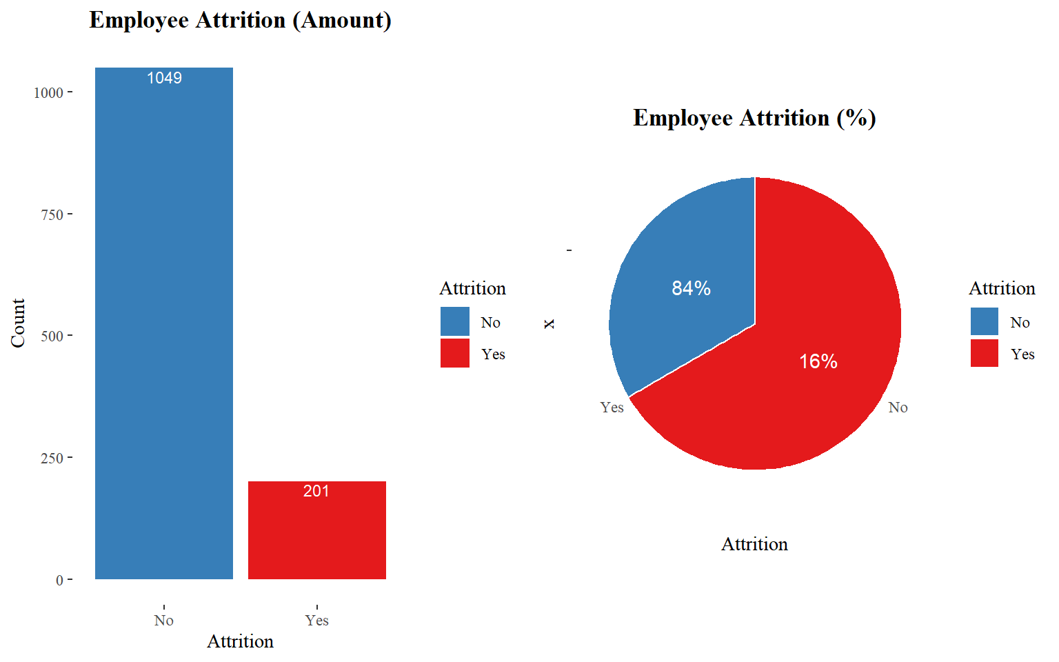
Distribution
Numerical Distribution
Categorical Distribution
Faceted Histogram
Attrition vs Features
Descriptive features
Age
As I see below, the majority of employees are between 28-36 years. It seems to a large majority of those who left were relatively younger.
ggplot(train_raw_tbl, aes(x=Age, fill=Attrition)) +
  geom_density(position="identity", alpha=0.5) +
  theme_classic() +
  scale_fill_manual(values=c("#377EB8","#E41A1C")) +
  ggtitle("Age by Attrition") +
  theme(plot.title = element_text(face = "bold", hjust = 0.5, size = 15), legend.position="bottom") +
labs(x = "Age") 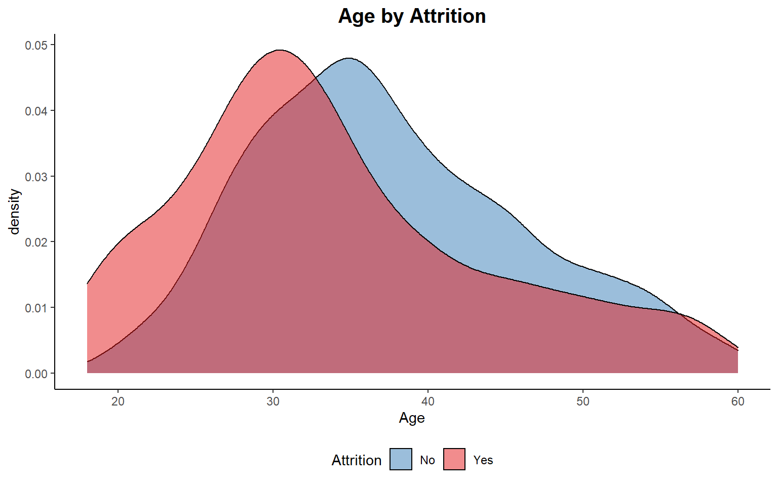
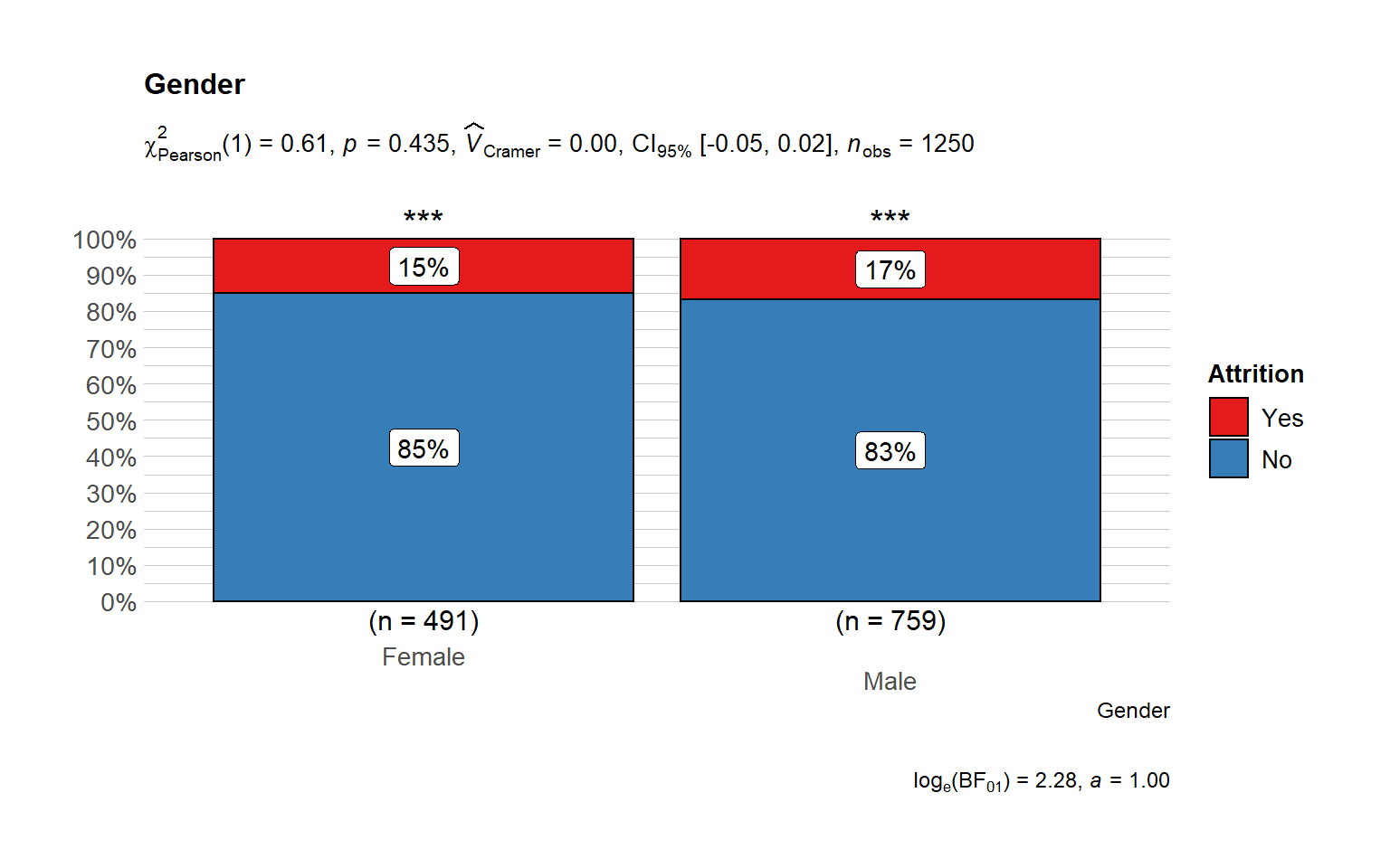
Gender does not play any role in attrition at least directly.
# plot
ggbarstats(
  data = train_raw_tbl,
  x = "Attrition",
  y = "Gender",
  sampling.plan = "jointMulti",
  title = "Gender",
  # xlab = "",
  # legend.title = "",
  ggtheme = hrbrthemes::theme_ipsum_pub(),
  ggplot.component = list(scale_x_discrete(guide = guide_axis(n.dodge = 2))),
  palette = "Set1",
  messages = FALSE
      )
Marital Status
It seems to a large majority of those who left was a relatively single.
train_raw_tbl %>%
  group_by(Attrition, MaritalStatus) %>%
  summarize(Count = n()) %>%
  mutate(pct = round(prop.table(Count),2) * 100) %>%
  ggplot(aes(x=Attrition, y=Count, fill=MaritalStatus)) +
  geom_bar(stat="identity", position=position_dodge()) +
  theme_tufte() +
  scale_fill_brewer(palette="Set2") +
  geom_text(aes(label= sprintf("%.2f%%", pct)), size = 4, vjust = 1.2,
            color = "#FFFFFF", position = position_dodge(0.9)) +
  ggtitle("Marital Status by Attrition") +
  theme(plot.title = element_text(face = "bold", hjust = 0.5, size = 15)) +
  labs(x = "Attrition", y = "Count")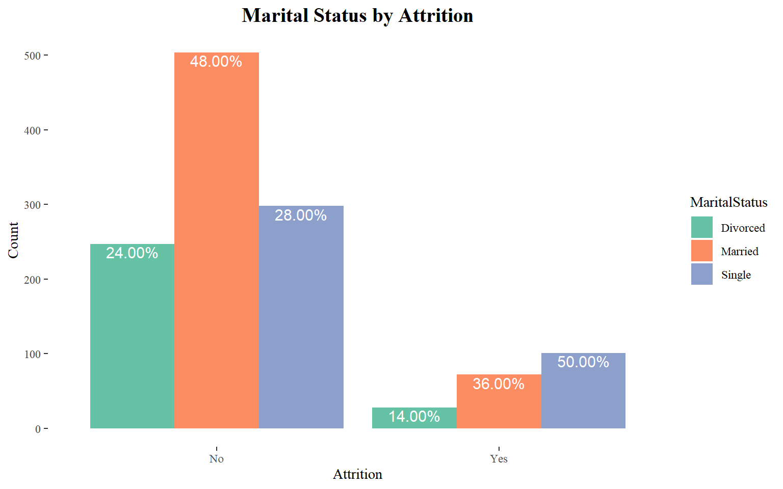
Single employees have more attrition across age groups. The married employees, who have lower monthly income, attrit more whereas divorced employees have not attrited much.
ggplot(train_raw_tbl) +
 aes(x = Age, y = MonthlyIncome, colour = Attrition, size = Age) +
 geom_point(alpha = 0.3,  position = position_jitter()) +
 scale_color_manual(values=c("#377EB8","#E41A1C")) +
 theme_tufte() +
 facet_grid(vars(), vars(MaritalStatus))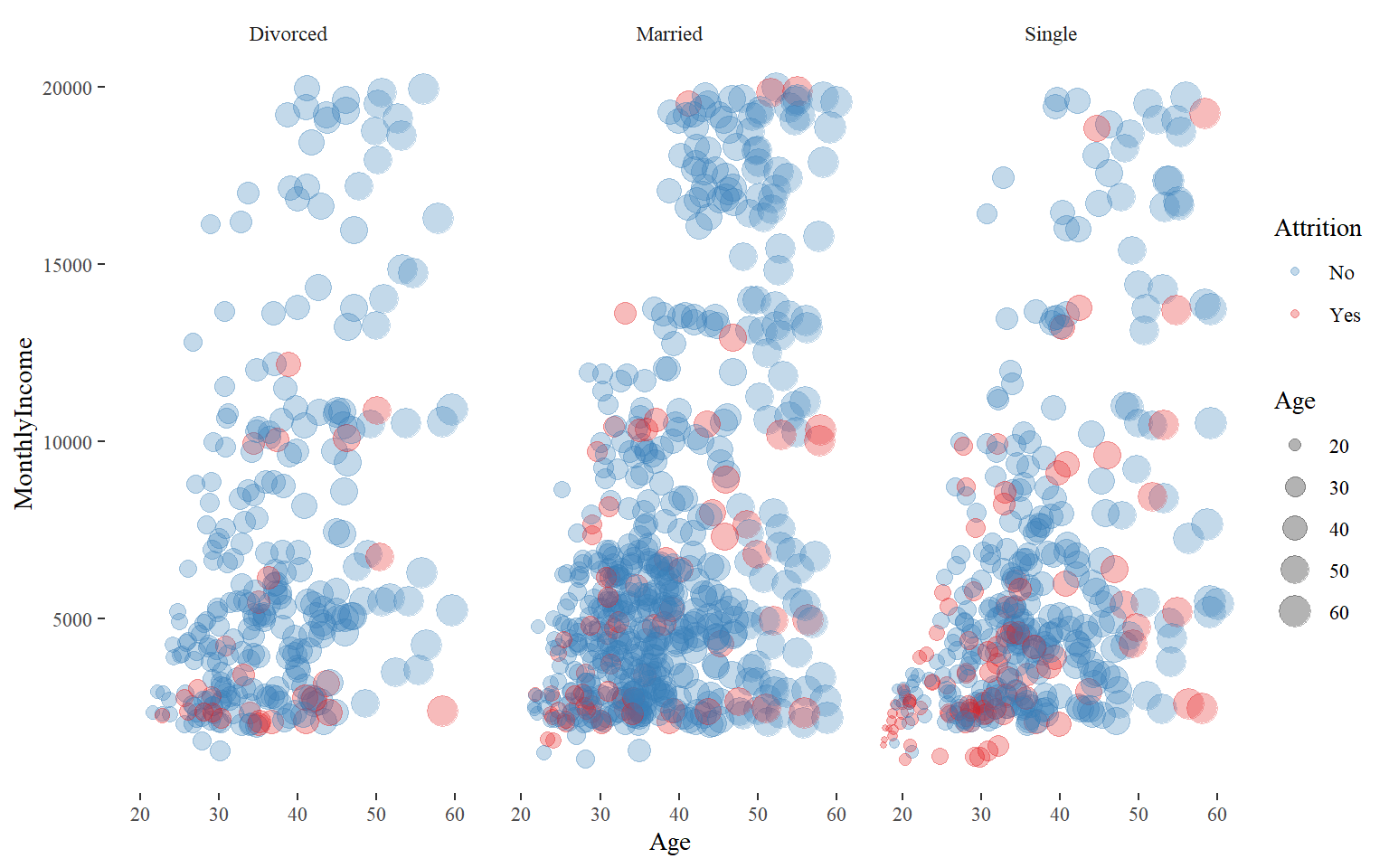
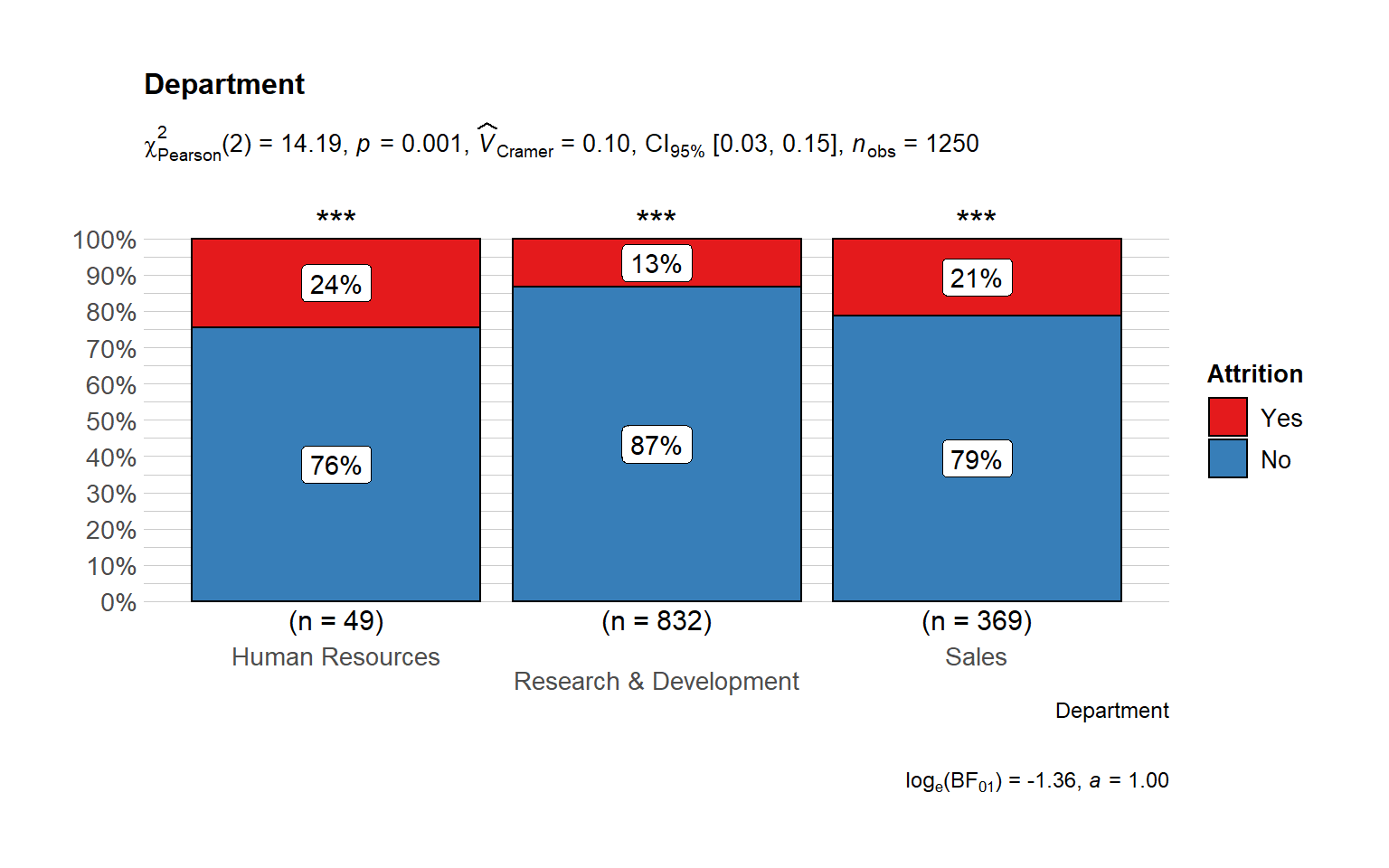
Employment features
## # A tibble: 6 x 4
## # Groups:   Department [3]
##   Department             Attrition Count Percentage
##   <chr>                  <chr>     <int>      <dbl>
## 1 Human Resources        No           37      0.755
## 2 Human Resources        Yes          12      0.245
## 3 Research & Development No          721      0.867
## 4 Research & Development Yes         111      0.133
## 5 Sales                  No          291      0.789
## 6 Sales                  Yes          78      0.211
The Majority of the employees are from R&D department and Sales and the highest turnover rate belongs to Human Resources Department where 24% have recorded attrition. It ould be a consequence of the high number of people from HR department.
Number of Employees by Job Role
Sales and Research Scientist are the job positions with the highest number of employees.
role.amount <- train_raw_tbl %>%
  select(JobRole) %>%
  group_by(JobRole) %>%
  summarize(amount=n()) %>%
  ggplot(aes(area=amount, fill=JobRole, label=JobRole)) +
  geom_treemap() +
  geom_treemap_text(grow = T, reflow = T, colour = "black") +
  scale_fill_brewer(palette = "YlOrRd") +
  theme(legend.position = "none") +
  labs(title = "Major Job Roles Inside the Organization",
  caption = "The area of each tile represents the number of employees by type of job role.",
  fill = "JobRole")

role.amount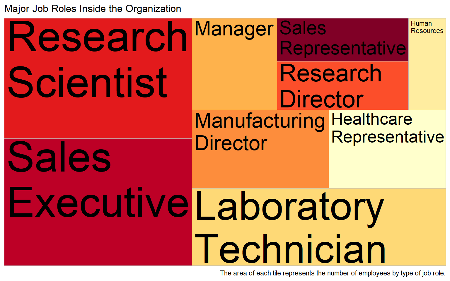
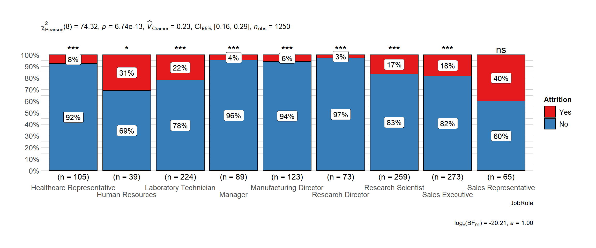
Attrition by Job Role
Sales Representatives, Human Resources and Lab Technician have the highest attrition rates. This could give us a hint that in these departments we are experiencing certain issues with employees.
# plot
      ggbarstats(
        data = train_raw_tbl,
        x = "Attrition",
        y = "JobRole",
        sampling.plan = "jointMulti",
        # title = "",
        # xlab = "",
        # legend.title = "",
        ggtheme = hrbrthemes::theme_ipsum_pub(),
        ggplot.component = list(scale_x_discrete(guide = guide_axis(n.dodge = 2))),
        palette = "Set1",
        messages = FALSE
      )
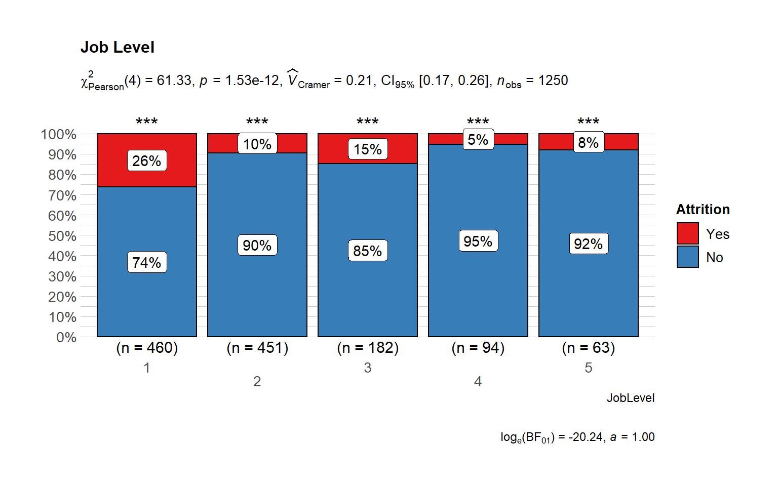
Attrition by Job Level
- Majority of the employees are in the lower and intermediate levels.
- Most attrition is from the lower level, followed by intermediate level.
It Shows that juniors are leaving the company most - addressing problems faced by lowest level at the company could help reduce attrition. The required training could be missing or long term roadmap could be an issue for junior level employees.
# plot
ggbarstats(
  data = train_raw_tbl,
  x = "Attrition",
  y = "JobLevel",
  sampling.plan = "jointMulti",
  title = "Job Level",
  # xlab = "",
  # legend.title = "",
  ggtheme = hrbrthemes::theme_ipsum_pub(),
  ggplot.component = list(scale_x_discrete(guide = guide_axis(n.dodge = 2))),
  palette = "Set1",
  messages = FALSE
      )
Compensation features
Income
The Impact of Income towards Attrition I wonder how much importance does each employee give to the income they earn in the organization. Here we will find out if it is true that money is really everything!
- What is the average monthly income by department? Are there any significant differences between individuals who quit and didn’t quit?
- Are there significant changes in the level of income by Job Satisfaction? Are individuals with a lower satisfaction getting much less income than the ones who are more satisfied?
- Do employees who quit the organization have a much lower income than people who didn’t quit the organization?
- Do employees with a higher performance rating earn more than with a lower performance rating? Is the difference significant by Attrition status?
Findings:
- Income by Departments: We can see huge differences in each department by attrition status.
- Income by Job Satisfaction: It seems the lower the job satisfaction the wider the gap by attrition status in the levels of income.
- Attrition sample population: I would say that most of this sample population has had a salary increase of less than 15% and a monthly income of less than 7,000
- Exhaustion at Work: Over 54% of workers who left the organization worked overtime! Will this be a reason why employees are leaving?
- Differences in the DailyRate:
HealthCare Representatives,Sales Representatives, andResearch Scientistshave the biggest daily rates differences in terms of employees who quit or didn’t quit the organization. This might indicate that at least for the these roles, the sample population that left the organization was mainly because ofincome.
It seems fair to say that a large majority of those who left had a relatively lower monthly income and daily rate while the never made it in majority into the higher hourly rate group. On the other hand, the differences become elusive when comparing the monthly rate.
g1 <- ggplot(train_raw_tbl,
            aes(x = MonthlyIncome, fill = Attrition)) +
            geom_density(alpha = 0.7) +
            theme_tufte() +
            scale_fill_manual(values=c("#377EB8","#E41A1C"))

g2 <- ggplot(train_raw_tbl,
            aes(x = HourlyRate, fill = Attrition)) +
            geom_density(alpha = 0.7) +
            theme_tufte() +
            scale_fill_manual(values=c("#377EB8","#E41A1C"))

g3 <- ggplot(train_raw_tbl,
            aes(x = DailyRate, fill = Attrition)) +
            geom_density(alpha = 0.7) +
            theme_tufte() +
            scale_fill_manual(values=c("#377EB8","#E41A1C"))

g4 <- ggplot(train_raw_tbl,
            aes(x = MonthlyRate, fill = Attrition)) +
            geom_density(alpha = 0.7) +
            theme_tufte() +
            scale_fill_manual(values=c("#377EB8","#E41A1C"))

grid.arrange(g1, g2, g3, g4, ncol = 2, nrow = 2) 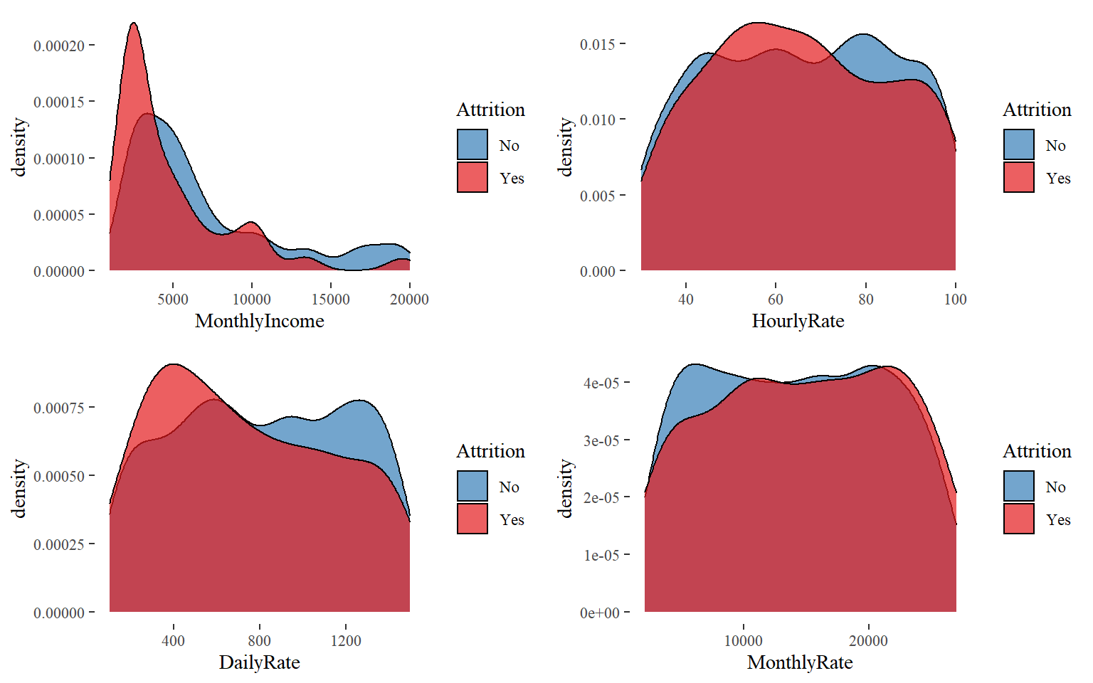
Monthly Income
It seems to a large majority of those who left had a relatively lower monthly income.
ggplot(train_raw_tbl, aes(x=Attrition, y=MonthlyIncome, color=Attrition, fill=Attrition)) +
  geom_boxplot() +
  theme_tufte() +
  scale_fill_manual(values=c("#377EB8","#E41A1C")) +
  scale_color_manual(values=c("#377EB8","#E41A1C")) +
  ggtitle("Monthly Income by Attrition") +
  theme(plot.title = element_text(face = "bold", hjust = 0.5, size = 15)) +
  labs(x = "Attrition", y = "Monthly Income")
train_raw_tbl %>% group_by(JobSatisfaction, Attrition) %>%
  summarize(N = mean(MonthlyIncome)) %>%
  ggplot(aes(x=JobSatisfaction, y=N, group=Attrition)) +
  geom_line(aes(linetype=Attrition, color=Attrition), size=1) +
  geom_point(aes(color=Attrition), size=2) +
  theme_tufte() +
  scale_color_manual(values=c("#377EB8","#E41A1C")) +
  ggtitle("Monthly Income by Attrition and Job Satisfaction") +
  theme(plot.title = element_text(face = "bold", hjust = 0.5, size = 15), legend.position="bottom") +
labs(x = "Job Satisfaction", y = "Monthly Income") 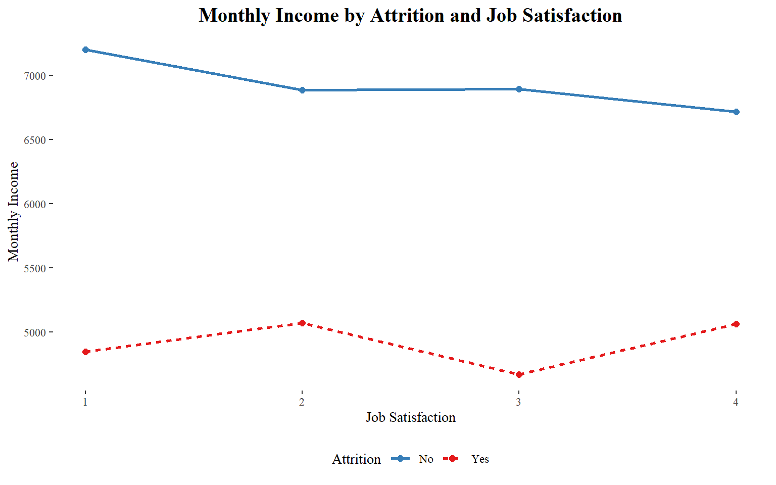
data_processed_tbl %>%
  ggplot(aes(Education, y=MonthlyIncome, fill=Attrition)) +
  geom_boxplot(position = position_dodge(1)) +
  theme_bw() +
  scale_fill_manual(values=c("#377EB8","#E41A1C")) +
  ggtitle("Monthly Income by Attrition and Educational_Level") +
  theme(plot.title = element_text(face = "bold", hjust = 0.5, size = 15)) +
  labs(x = "Attrition", y = "Count")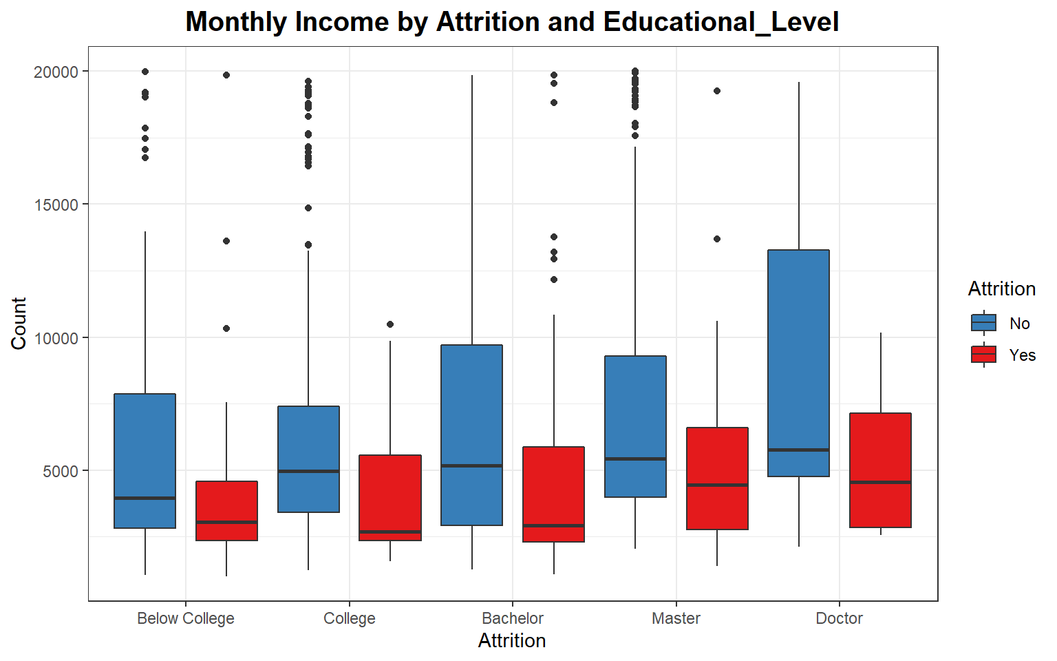
Income by gender
monthly_income <- ggplot(train_raw_tbl, aes(x=Gender, y=MonthlyIncome, color=Gender, fill=Gender)) + geom_boxplot() +
  scale_fill_manual(values=c("#F5A9F2", "#5882FA")) +
  scale_color_manual(values=c("#FE2EF7", "#5858FA")) +
  coord_flip() + labs(title="Are there any Gender Disparities in Income?")

gender.income <- train_raw_tbl %>%
  select(Gender, MonthlyIncome) %>%
  group_by(Gender) %>%
  summarize(avg_income=round(mean(MonthlyIncome), 2)) %>%
  ggplot(aes(Gender, avg_income, fill=Gender)) +
  geom_col() +
  theme_tufte() +
  scale_fill_manual(values=c("#F5A9F2", "#5882FA")) +
  scale_color_manual(values=c("#FE2EF7", "#5858FA")) +
  geom_text(aes(x=Gender, y=0.01, label= paste0("$ ", avg_income)),
             vjust=-4, size=3, colour="black", fontface="bold") +
  labs(title="Average Salary by Gender", x="Gender",y="Salary") +
  theme(plot.title=element_text(size=14, hjust=0.5))

plot_grid(monthly_income, gender.income, ncol=2, nrow=1)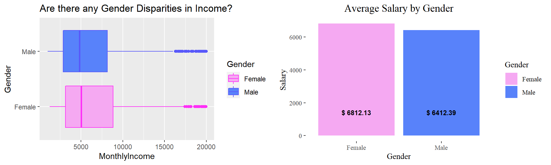
Average Income by Department
Let’s determine if income was a major factor when it came to leaving the company. Let’s start by taking the average monthly income of people who left the company and people who stayed in the company.
# Group by department
avg.income <- train_raw_tbl %>%
  select(Department, MonthlyIncome, Attrition) %>%
  group_by(Attrition, Department) %>%
  summarize(avg.inc=mean(MonthlyIncome)) %>%
  ggplot(aes(x=reorder(Department, avg.inc), y=avg.inc, fill=Attrition)) +
  geom_bar(stat="identity", position="dodge") +
  facet_wrap(~Attrition) +
  theme_tufte() +
  theme(axis.text.x = element_text(angle = 20), plot.title=element_text(hjust=0.2,vjust=-0.2)) +
  scale_fill_manual(values=c("#377EB8","#E41A1C")) +
  labs(y="Average Income", x="Department", title="Average Income by Department \n and Attrition Status") +
  geom_text(aes(x=Department, y=0.01, label= paste0("$ ", round(avg.inc,2))),
             vjust=-0.5, size=3, colour="black", fontface="bold")
avg.income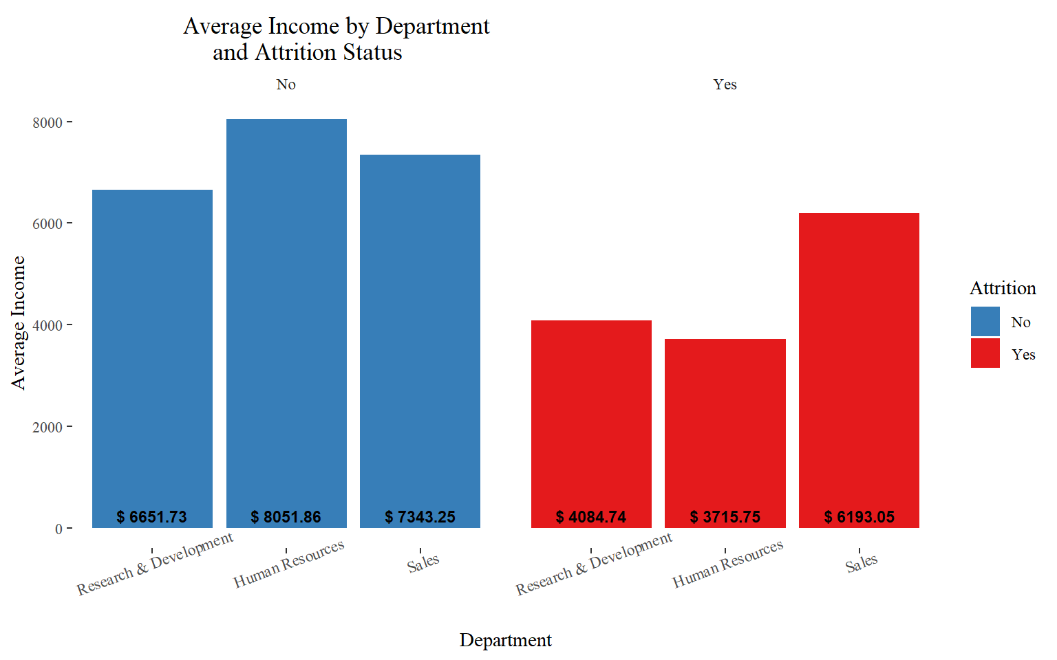
Determining Satisfaction by Income:
# Turn the column to factor: One because it should not be considered an integer
# Two: Will help us sort in an orderly manner.
train_raw_tbl$JobSatisfaction <- as.factor(train_raw_tbl$JobSatisfaction)

high.inc <- train_raw_tbl %>% select(JobSatisfaction, MonthlyIncome, Attrition) %>%
  group_by(JobSatisfaction, Attrition) %>%
  summarize(med=median(MonthlyIncome)) %>%
  ggplot(aes(x=fct_reorder(JobSatisfaction, -med), y=med, color=Attrition)) +
  geom_point(size=3) +
  geom_segment(aes(x=JobSatisfaction, xend=JobSatisfaction, y=0, yend=med)) +
  facet_wrap(~Attrition) +
  labs(title="Is Income a Reason for Employees to Leave?", subtitle="by Attrition Status",
       y="Median Income",x="Level of Job Satisfaction") +
  theme(axis.text.x = element_text(angle=65, vjust=0.6), plot.title=element_text(hjust=0.5),
        strip.background = element_blank(),
        strip.text = element_blank()) +
  coord_flip() + theme_minimal() + scale_color_manual(values=c("#377EB8","#E41A1C")) +
  geom_text(aes(x=JobSatisfaction, y=0.01, label= paste0("$ ", round(med,2))),
            hjust=-0.5, vjust=-0.5, size=4,
            colour="black", fontface="italic",angle=360)
high.inc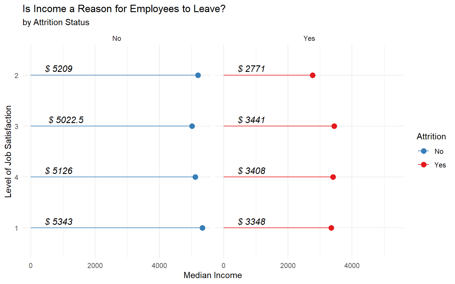
Income and the Level of Attrition
per.sal <- train_raw_tbl %>%
  select(Attrition, PercentSalaryHike, MonthlyIncome) %>%
  ggplot(aes(x=PercentSalaryHike, y=MonthlyIncome)) +
  geom_jitter(aes(col=Attrition), alpha=0.5) +
  theme_economist() + theme(legend.position="none") +
  scale_color_manual(values=c("#377EB8","#E41A1C")) +
  labs(title="Income and its Impact on Attrition") +
  theme(plot.title=element_text(hjust=0.5, color="black"),
        plot.background=element_rect(fill="#f2f2f2"),
        axis.text.x=element_text(colour="black"),
        axis.text.y=element_text(colour="black"),
        axis.title=element_text(colour="black"))

perf.inc <- train_raw_tbl %>%
  select(PerformanceRating, MonthlyIncome, Attrition) %>%
  group_by(factor(PerformanceRating), Attrition) %>%
  ggplot(aes(x=factor(PerformanceRating), y=MonthlyIncome, fill=Attrition)) +
  geom_violin() +
  coord_flip() +
  facet_wrap(~Attrition) +
  scale_fill_manual(values=c("#377EB8","#E41A1C")) +
  theme_economist() +
  theme(legend.position="bottom", strip.background = element_blank(),
        strip.text.x = element_blank(),
        plot.title=element_text(hjust=0.5, color="black"),
        plot.background=element_rect(fill="#f2f2f2"),
        axis.text.x=element_text(colour="black"),
        axis.text.y=element_text(colour="black"),
        axis.title=element_text(colour="black"),
        legend.text=element_text(color="black")) +
  labs(x="Performance Rating",y="Monthly Income")
plot_grid(per.sal, perf.inc, nrow=2)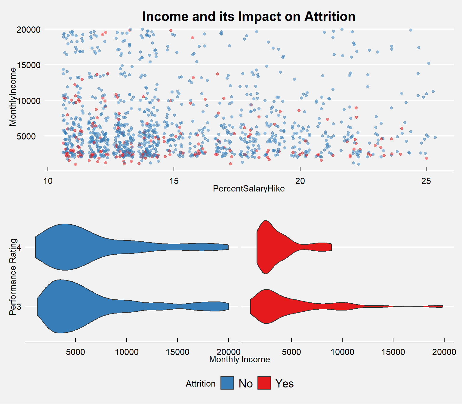
Salary by Job role
Managers and Research Directors have the highest salary on average.
# Median Salary
job.sal <- train_raw_tbl %>%
  select(JobRole, MonthlyIncome) %>%
  group_by(JobRole) %>%
  summarize(med=median(MonthlyIncome), avg=mean(MonthlyIncome))


p1 <- ggplot(job.sal, aes(x=reorder(JobRole,-med), y=med)) +  geom_bar(stat="identity", width=.5, fill="#FE9A2E") +
  labs(title="Salary by Job Role", subtitle="Median",x="Job Role",y="Median Income") +
  theme(axis.text.x = element_text(angle=90, vjust=0.6))


p2 <- ggplot(job.sal, aes(x=reorder(JobRole,-avg), y=avg)) +  geom_bar(stat="identity", width=.5, fill="#BE81F7") +
  labs(title="Salary by Job Role", subtitle="Mean",x="Job Role",y="Mean Income") +
  theme(axis.text.x = element_text(angle=90, vjust=0.6))


plot_grid(p1, p2, ncol=2)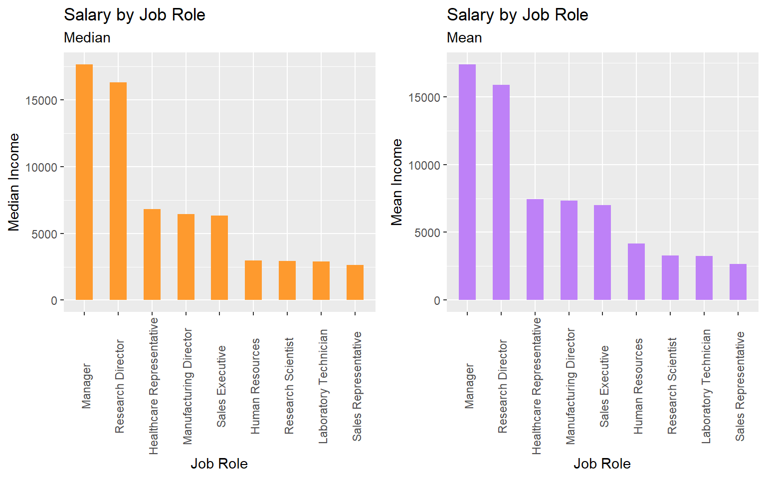
Stock Option
# Let's see what the Average MonthlyIncome is for those who have stockoptionlevels and for those who don't.
# First let's see how many employees have Stockoption levels.

stockoption <- train_raw_tbl %>%
  select(StockOptionLevel, Attrition) %>%
  group_by(StockOptionLevel, Attrition) %>%
  summarize(n=n())  %>%
  ggplot(aes(x=reorder(StockOptionLevel, -n), y=n, fill=factor(StockOptionLevel))) +
  geom_bar(stat="identity") + coord_flip() +
  facet_wrap(~Attrition) + theme_economist() + scale_fill_manual(values=c("#DF0101", "#F5A9A9", "#BEF781", "#04B404")) +
  guides(fill=guide_legend(title="Stock Option \n Level")) +
  theme(legend.position="none", plot.background=element_rect(fill="white"), plot.title=element_text(hjust=0.5, color="black"),
        axis.text.x=element_text(colour="black"), axis.text.y=element_text(colour="black"),
        axis.title=element_text(colour="black"),
        strip.text.x = element_text(color="black"),
        legend.text=element_text(color="black"))  +
  geom_label(aes(label=n, fill = factor(StockOptionLevel)), colour = "black", fontface = "italic", hjust=0.55) +
  labs(title="Number of Employees", x="StockOptionLevel", y="Amount")

# Average income by StockOption using the geom_line()

income_stockoption <- train_raw_tbl %>%
  select(StockOptionLevel, MonthlyIncome, Attrition) %>%
  group_by(StockOptionLevel, Attrition) %>%
  ggplot(aes(x=MonthlyIncome)) +
  geom_area(aes(fill=factor(StockOptionLevel)), stat ="bin", bins=100, alpha=0.8) +
  facet_wrap(~Attrition) +
  theme_economist() +   scale_fill_manual(values=c("#DF0101", "#F5A9A9", "#BEF781", "#04B404")) +
  guides(fill=guide_legend(title="Stock Option \n Level")) +
  theme(legend.position="bottom", plot.background=element_rect(fill="white"), plot.title=element_text(hjust=0.5, color="black"),
        axis.text.x=element_text(colour="black"), axis.text.y=element_text(colour="black"),axis.title=element_text(colour="black"),
        strip.text.x = element_text(color="black"),
        legend.text=element_text(color="black"),
        legend.background = element_rect(fill="#FFF9F5",size=0.5, linetype="solid", colour ="black"))

plot_grid(stockoption, income_stockoption, nrow=2)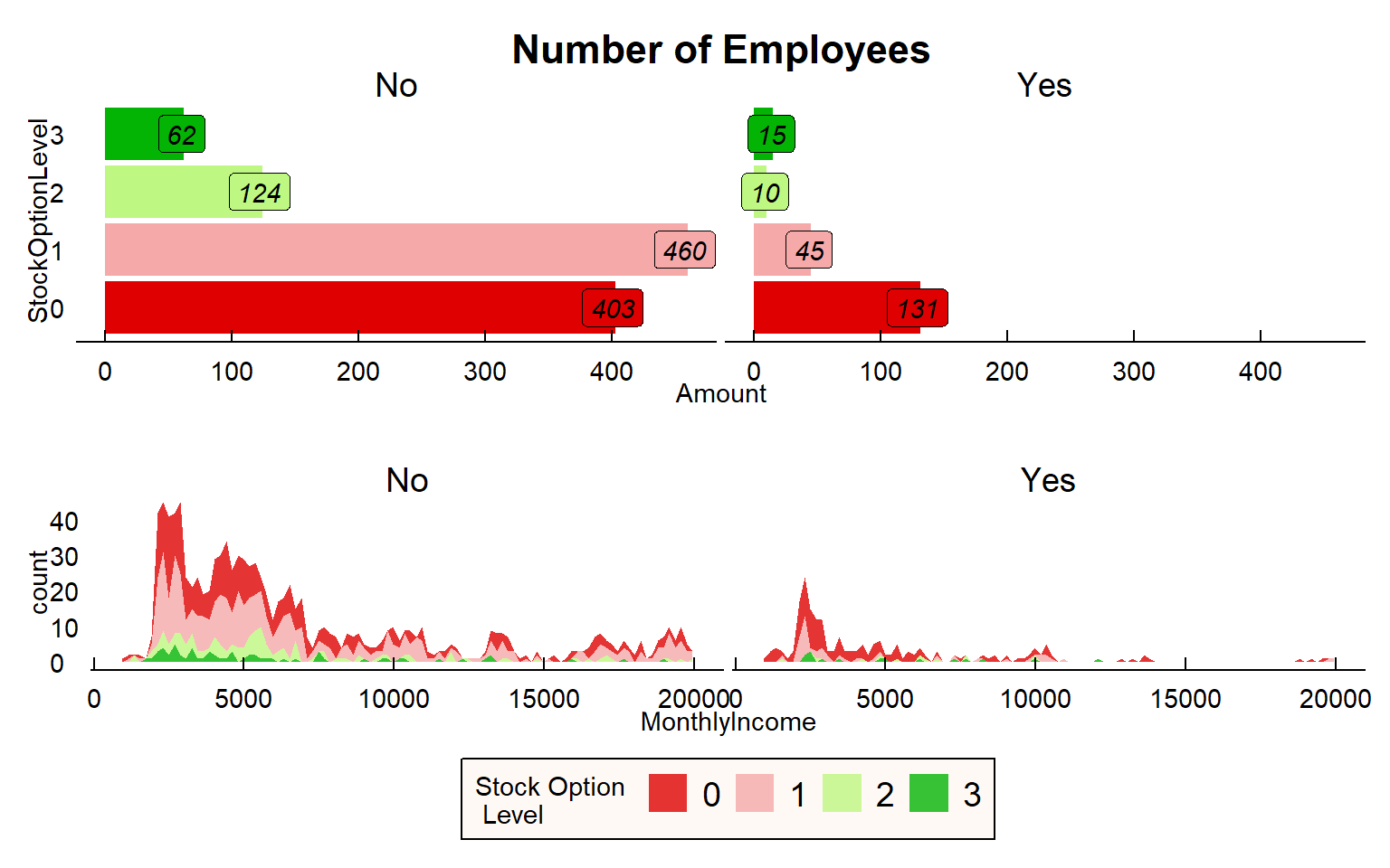
Survey Results
# plot
ggbarstats(
  data = train_raw_tbl,
  x = "Attrition",
  y = "JobSatisfaction",
  sampling.plan = "jointMulti",
  title = "Job Satisfaction",
  #xlab = "",
  # legend.title = "",
  ggtheme = hrbrthemes::theme_ipsum_pub(),
  ggplot.component = list(scale_x_discrete(guide = guide_axis(n.dodge = 2))),
  palette = "Set1",
  messages = FALSE)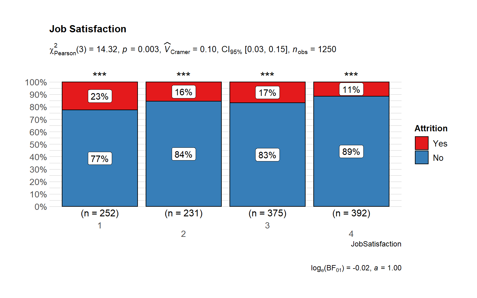
Working Environment
In this section, we will explore everything that is related to the working environment and the structure of the organization.
# Environment Satisfaction let's use the changes by Job Role

env.attr <- train_raw_tbl %>%
  select(EnvironmentSatisfaction, JobRole, Attrition) %>%
  group_by(JobRole, Attrition) %>%
  summarize(avg.env=mean(EnvironmentSatisfaction))

ggplot(env.attr, aes(x=JobRole, y=avg.env)) + geom_line(aes(group=Attrition), color="#58ACFA", linetype="dashed") +
geom_point(aes(color=Attrition), size=3) +  theme_economist() +
  theme(plot.title=element_text(hjust=0.5), axis.text.x=element_text(angle=90),
        plot.background=element_rect(fill="#f2f2f2")) +
  labs(title="Working Environment", y="Average Environment Satisfaction", x="Job Position") +
  scale_color_manual(values=c("#58FA58", "#FA5858"))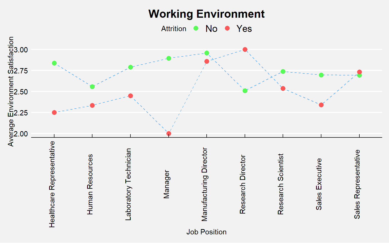
Performance
# plot
ggbarstats(
  data = train_raw_tbl,
  x = "Attrition",
  y = "JobInvolvement",
  sampling.plan = "jointMulti",
  title = "Job Involvement",
  # xlab = "",
  # legend.title = "",
  ggtheme = hrbrthemes::theme_ipsum_pub(),
  ggplot.component = list(scale_x_discrete(guide = guide_axis(n.dodge = 2))),
  palette = "Set1",
  messages = FALSE)
# plot
ggbarstats(
  data = train_raw_tbl,
  x = "Attrition",
  y = "PerformanceRating",
  sampling.plan = "jointMulti",
  title = "Performance Rating",
  #xlab = "",
  # legend.title = "",
  ggtheme = hrbrthemes::theme_ipsum_pub(),
  ggplot.component = list(scale_x_discrete(guide = guide_axis(n.dodge = 2))),
  palette = "Set1",
  messages = FALSE)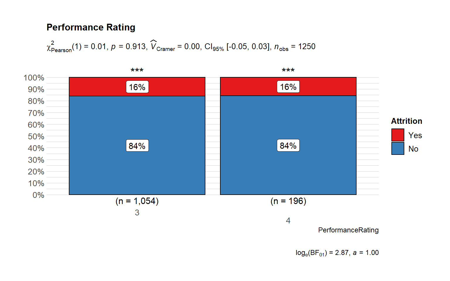
Promotion
# plot
ggbarstats(
  data = train_raw_tbl,
  x = "Attrition",
  y = "YearsSinceLastPromotion",
  sampling.plan = "jointMulti",
  title = "Years since last promotion",
  results.subtitle = FALSE,
  # xlab = "",
  # legend.title = "",
  ggtheme = hrbrthemes::theme_ipsum_pub(),
  ggplot.component = list(scale_x_discrete(guide = guide_axis(n.dodge = 2))),
  palette = "Set1",
  messages = FALSE)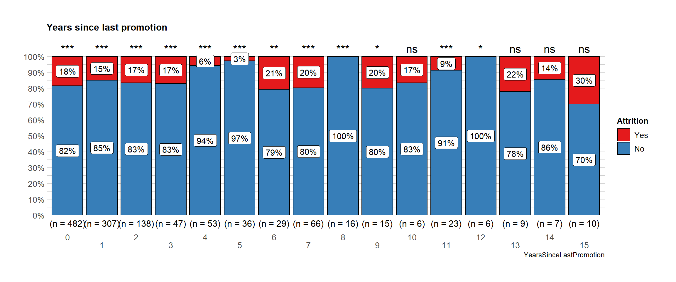
This shows years at company in relation to years since last promotion, grouped by both attrition and overtime. This is an interesting issue, since a high correlation between these two variables (longer you are in the company, less chance you have to be promoted, so to speak) may mean that people are not really growing within the company. However, since this is a simulated dataset we cannot compare it with some norms outside it, so we can compare certain groups within our set, e.g. those who are working overtime and those who are not.
ggplot(train_raw_tbl,
       aes(y = YearsSinceLastPromotion, x = YearsAtCompany, colour = OverTime)) +
  geom_jitter(size = 1, alpha = 0.7) +
  geom_smooth(method = "glm") +
  facet_wrap(~ Attrition) +
  ggtitle("Attrition") +
  scale_colour_manual(values = c("#386cb0","#fdb462")) +
theme(plot.title = element_text(hjust = 0.5)) + theme_tufte() 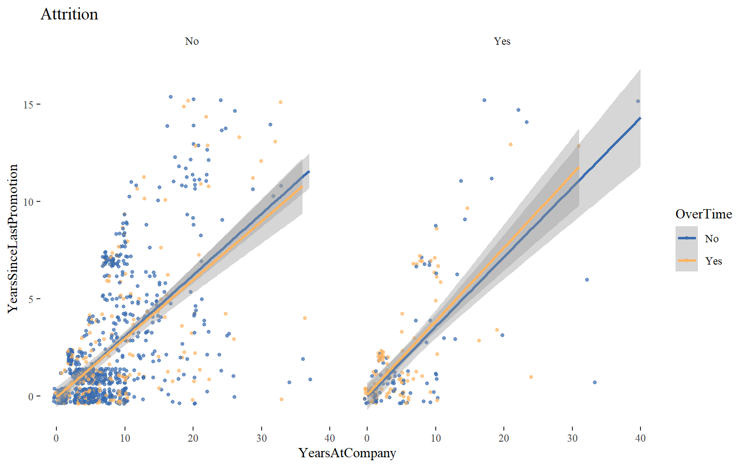
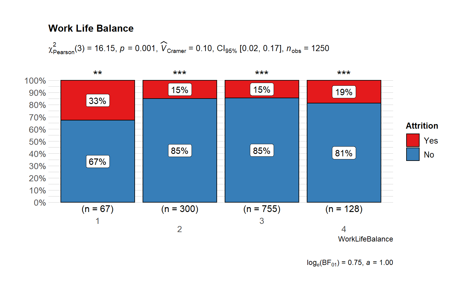
Work Life
# plot
      ggbarstats(
        data = train_raw_tbl,
        x = "Attrition",
        y = "WorkLifeBalance",
        sampling.plan = "jointMulti",
        title = "Work Life Balance",
        # xlab = "",
        # legend.title = "",
        ggtheme = hrbrthemes::theme_ipsum_pub(),
        ggplot.component = list(scale_x_discrete(guide = guide_axis(n.dodge = 2))),
        palette = "Set1",
        messages = FALSE
      )
How many employees quit by Department? Did they have a proper work-life balance?
attritions <- train_raw_tbl %>%
  filter(Attrition == "Yes")

attritions$WorkLifeBalance <- as.factor(attritions$WorkLifeBalance)

by.department <- attritions %>%
  select(Department, WorkLifeBalance) %>%
  group_by(Department, WorkLifeBalance) %>%
  summarize(count=n()) %>%
  ggplot(aes(x=fct_reorder(WorkLifeBalance, -count), y=count, fill=Department)) + geom_bar(stat='identity') +
  facet_wrap(~Department) +
  theme_economist() + theme(legend.position="bottom", plot.title=element_text(hjust=0.5),
                            plot.background=element_rect(fill="#f2f2f2")) +
  scale_fill_manual(values=c("#FA5882", "#819FF7", "#FE2E2E")) +
  geom_label(aes(label=count, fill = Department), colour = "white", fontface = "italic") +
  labs(title="Is there a Work Life Balance Environment?", x="Work and Life Balance", y="Number of Employees")

by.department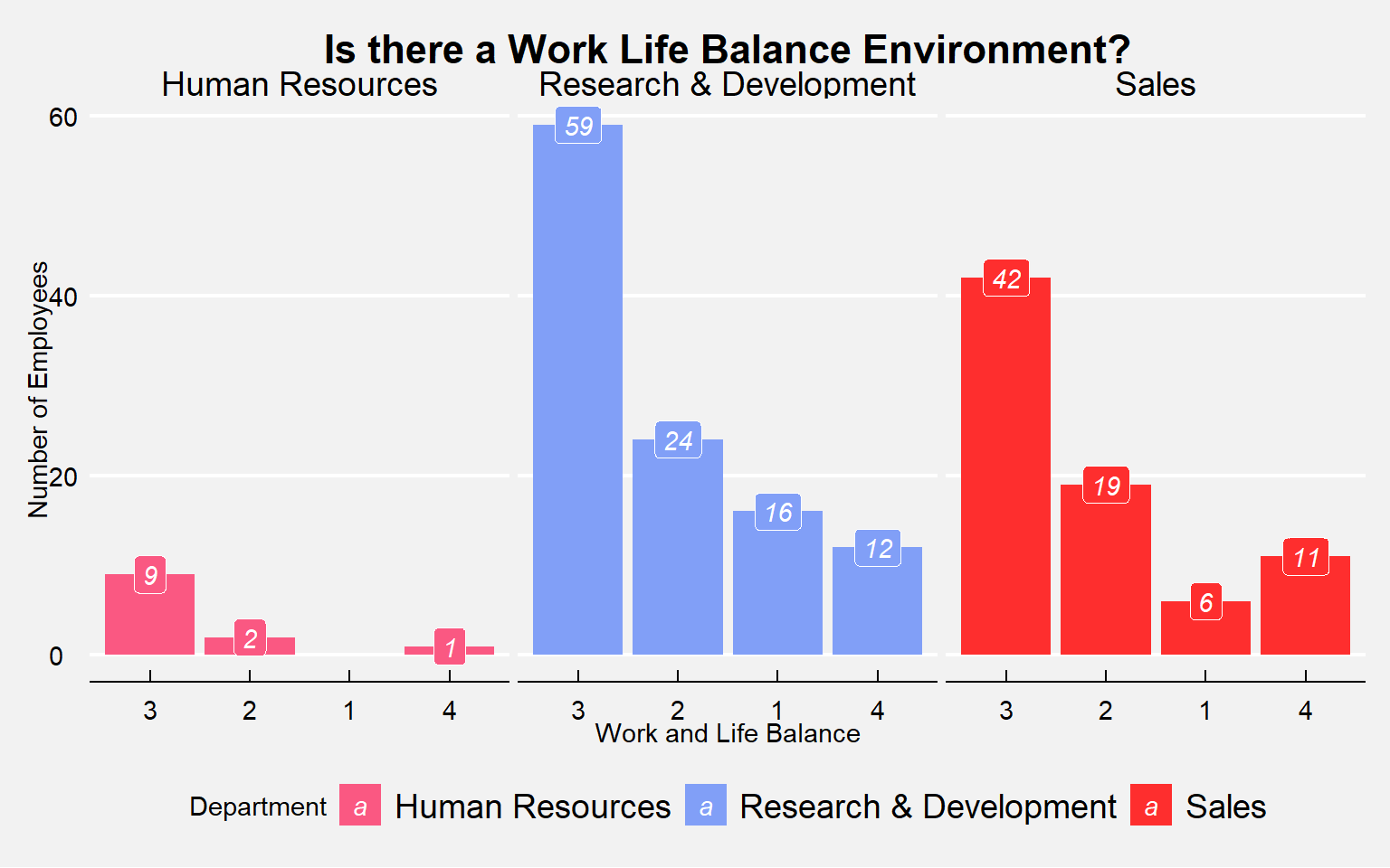
Work life balance vs Distance from home
ggplot(train_raw_tbl,
       aes(x= WorkLifeBalance, y=DistanceFromHome, group = WorkLifeBalance, fill = WorkLifeBalance)) +
  geom_boxplot(alpha=0.7) +
  theme(legend.position="none") +
  theme_classic() +
  facet_wrap(~ Attrition) +
  ggtitle("Attrition") +
  theme(plot.title = element_text(hjust = 0.5))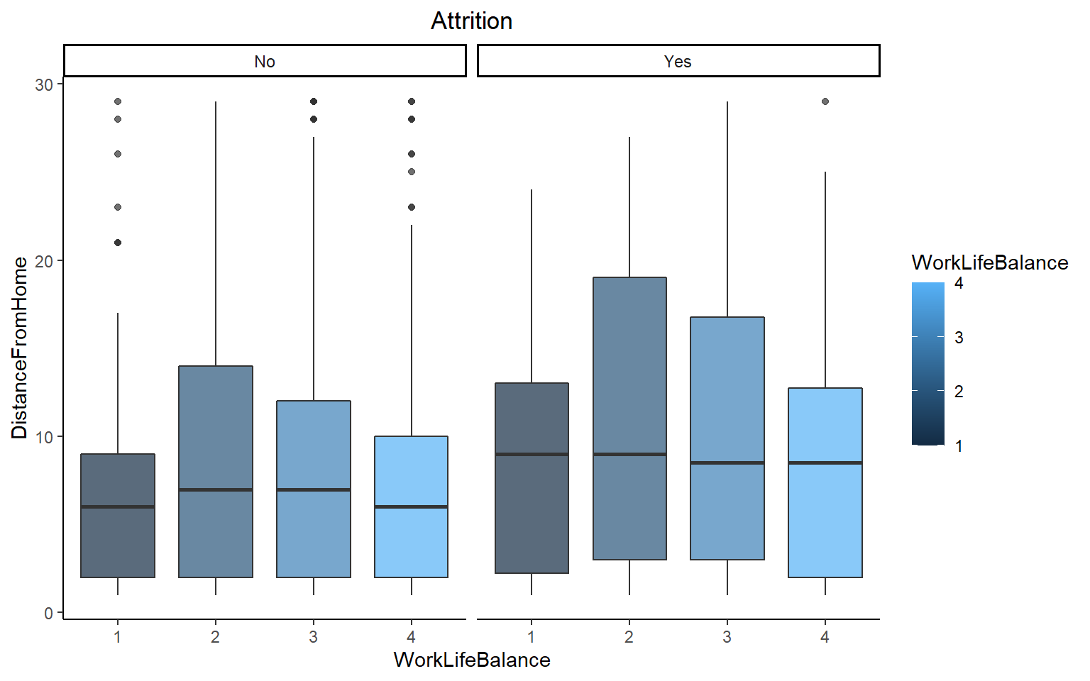
There is a relatively higher percentage of people working overtime in the group of those who left. It could be due to workload. Discussing on regular basis about the workload, may solve this problem.
# plot
ggbarstats(
  data = train_raw_tbl,
  x = "Attrition",
  y = "OverTime",
  sampling.plan = "jointMulti",
  title = "Level of Attrition by Overtime Status",
  results.subtitle = FALSE,
  # xlab = "",
  # legend.title = "",
  ggtheme = hrbrthemes::theme_ipsum_pub(),
  ggplot.component = list(scale_x_discrete(guide = guide_axis(n.dodge = 2))),
  palette = "Set1",
  messages = FALSE)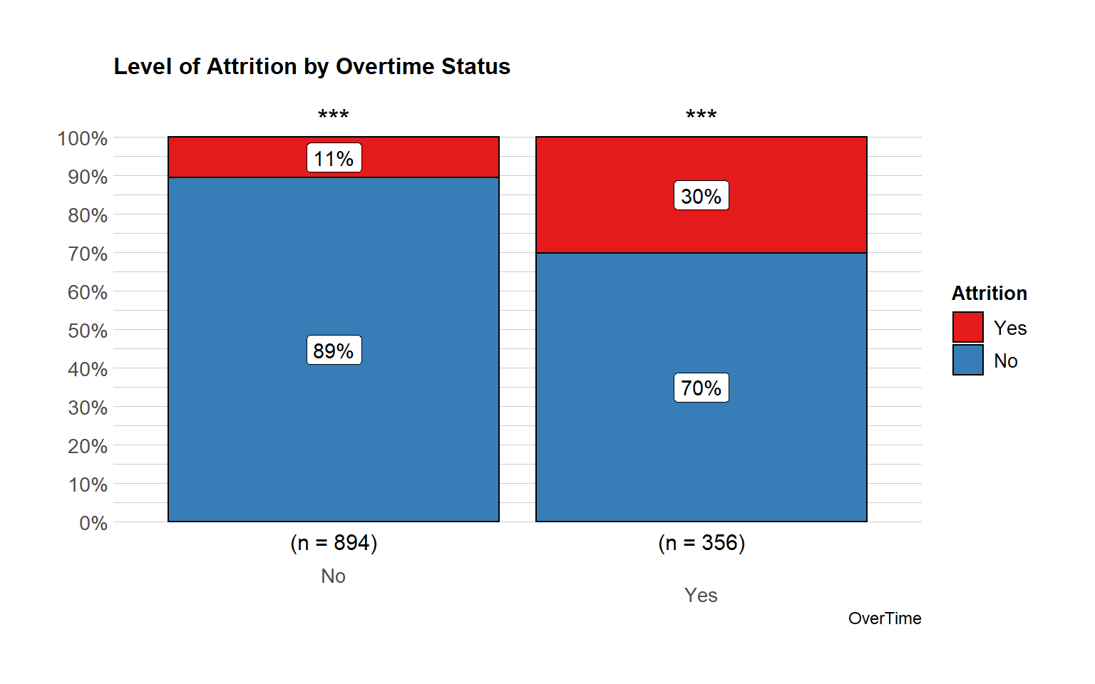
overtime_percent <- train_raw_tbl %>%
  select(OverTime, Attrition) %>%
  filter(Attrition == "Yes") %>%
  group_by(Attrition, OverTime) %>%
  summarize(n=n()) %>%
  mutate(pct=round(prop.table(n),2) * 100) %>%
  ggplot(aes(x="", y=pct, fill=OverTime)) +
  geom_bar(width = 1, stat = "identity") + coord_polar("y", start=0) +
  theme_tufte() + scale_fill_manual(values=c("#377EB8","#E41A1C")) +
  geom_label(aes(label = paste0(pct, "%")),
             position = position_stack(vjust = 0.5), colour = "black",  fontface = "italic") +
  theme(legend.position="bottom", strip.background = element_blank(), strip.text.x = element_blank(),
        plot.title=element_text(hjust=0.5, color="black"), plot.subtitle=element_text(color="black"),
        plot.background=element_rect(fill="#FFFFFF"),axis.text.x=element_text(colour="white"),
        axis.text.y=element_text(colour="black"), axis.title=element_text(colour="black"),
        legend.background = element_rect(fill="#FFF9F5",size=0.5, linetype="solid", colour ="black")) +
  labs(title="Level of Attrition by Overtime Status", subtitle="In Percent", x="", y="")


overtime_number <- train_raw_tbl %>%
  select(OverTime, Attrition) %>%
  filter(Attrition == "Yes") %>%
  group_by(Attrition, OverTime) %>%
  summarize(n=n()) %>%
  mutate(pct=round(prop.table(n),2) * 100) %>%
  ggplot(aes(x=OverTime, y=n, fill=OverTime)) + geom_bar(stat="identity") + scale_fill_manual(values=c("#377EB8","#E41A1C")) +
  geom_label(aes(label=paste0(n)), fill="#FFF9F5", colour = "black", fontface = "italic") +
  labs(title="Level of Attrition by Overtime Status", subtitle="In Numbers", x="Overtime Status", y="Number of Employees") + theme_minimal() +
  theme(legend.position="bottom", strip.background = element_blank(), strip.text.x = element_blank(),
        plot.title=element_text(hjust=0.5, color="black"), plot.subtitle=element_text(color="black"),
        plot.background=element_rect(fill="#FFFFFF"), axis.text.x=element_text(colour="black"), axis.text.y=element_text(colour="black"),
        axis.title=element_text(colour="black"),
        legend.background = element_rect(fill="#FFF9F5",size=0.5, linetype="solid", colour ="black"))
plot_grid(overtime_percent, overtime_number)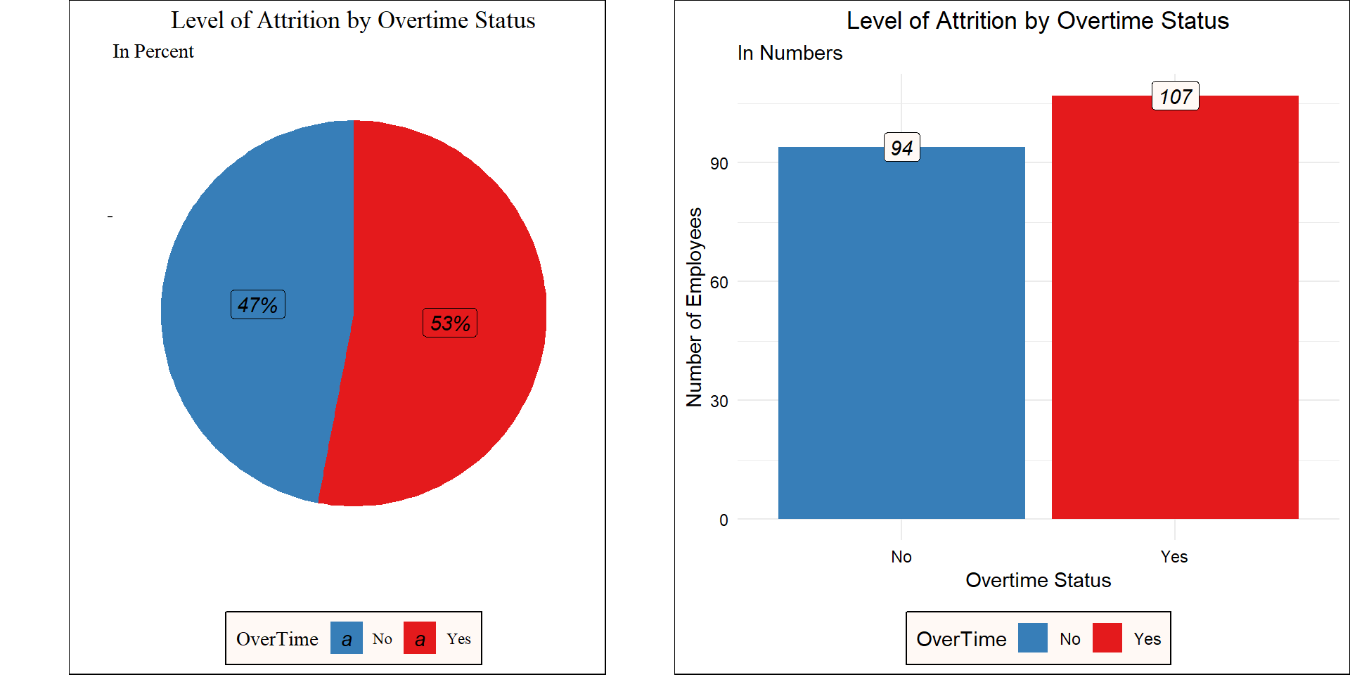
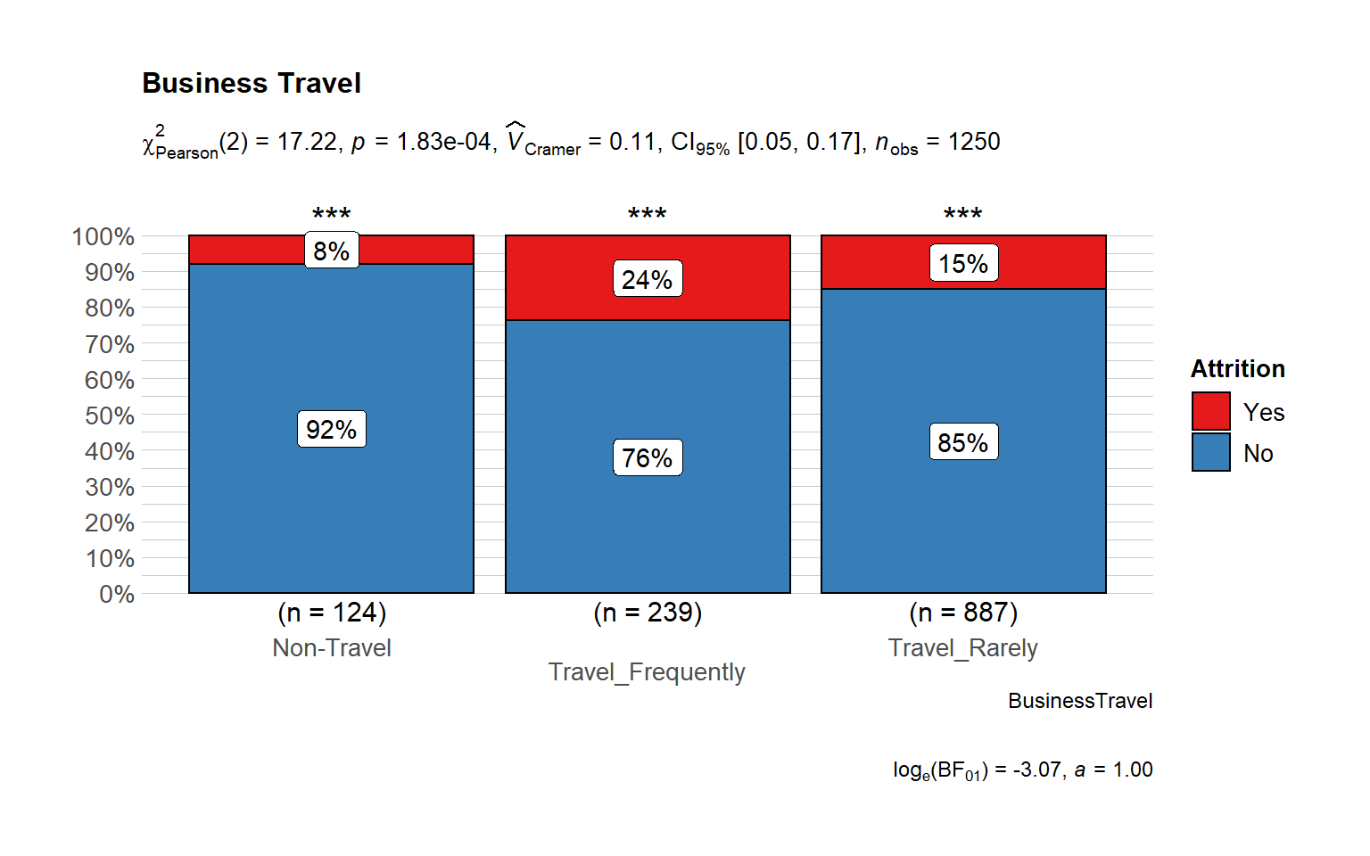
# Attrition vs Business Travel
ggbarstats(
  data = train_raw_tbl,
  x = "Attrition",
  y = "BusinessTravel",
  sampling.plan = "jointMulti",
  title = "Business Travel",
  # xlab = "",
  # legend.title = "",
  ggtheme = hrbrthemes::theme_ipsum_pub(),
  ggplot.component = list(scale_x_discrete(guide = guide_axis(n.dodge = 2))),
  palette = "Set1",
  messages = FALSE
)
Home Distance from Work
It seems to a large majority of those who left had a relatively lower distance from work.
ggplot(train_raw_tbl, aes(x=DistanceFromHome, fill=Attrition, color=Attrition)) +
  geom_density(position="identity", alpha=0.5) +
  theme_tufte() +
  scale_fill_manual(values=c("#377EB8","#E41A1C")) +
  ggtitle("Distance from Work by Attrition") +
  theme(plot.title = element_text(face = "bold", hjust = 0.5, size = 15), legend.position="bottom") +
labs(x = "Distance from Work") 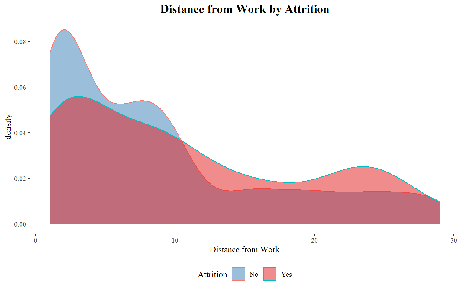
Is distance from work a huge factor in terms of quitting the organization? - Determine the average distance of people who did not quit the organization.Then use this number as an anchor to create a column for the employees that quit.
Training and Education
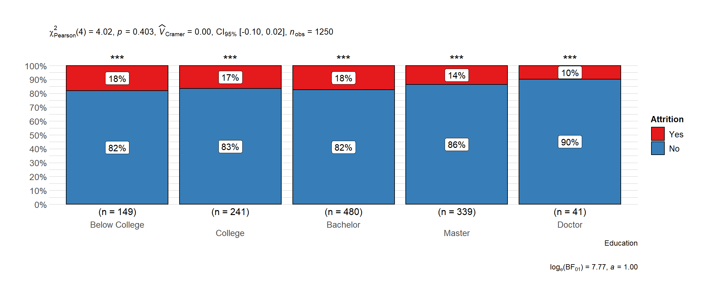
Attrition by Level of Education
This goes hand in hand with the previous statement, as bachelors are the ones showing the highest level of attrition which makes sense since Millenials create the highest turnover rate inside the organization.
# plot
ggbarstats(
  data = data_processed_tbl,
  x = "Attrition",
  y = "Education",
  sampling.plan = "jointMulti",
  # title = "",
  # xlab = "",
  # legend.title = "",
  ggtheme = hrbrthemes::theme_ipsum_pub(),
  ggplot.component = list(scale_x_discrete(guide = guide_axis(n.dodge = 2))),
  palette = "Set1",
  messages = FALSE
      )
# I want to know in terms of proportions if we are loosing key talent here.
edu.level <- data_processed_tbl %>%
  select(Education, Attrition) %>%
  group_by(Education, Attrition) %>%
  summarize(n=n()) %>%
  ggplot(aes(x=fct_reorder(Education,n), y=n, fill=Attrition, color=Attrition)) +
  geom_bar(stat="identity") +
  facet_wrap(~Attrition) +
  coord_flip() +
  scale_fill_manual(values=c("#377EB8","#E41A1C")) +
  scale_color_manual(values=c("#377EB8","#E41A1C")) +
  geom_label(aes(label=n, fill = Attrition), colour = "white", fontface = "italic") +
  labs(x="", y="Number of Employees", title="Attrition by Educational Level") + theme_clean() +
  theme(legend.position="none", plot.title=element_text(hjust=0.5, size=14))

edu.level
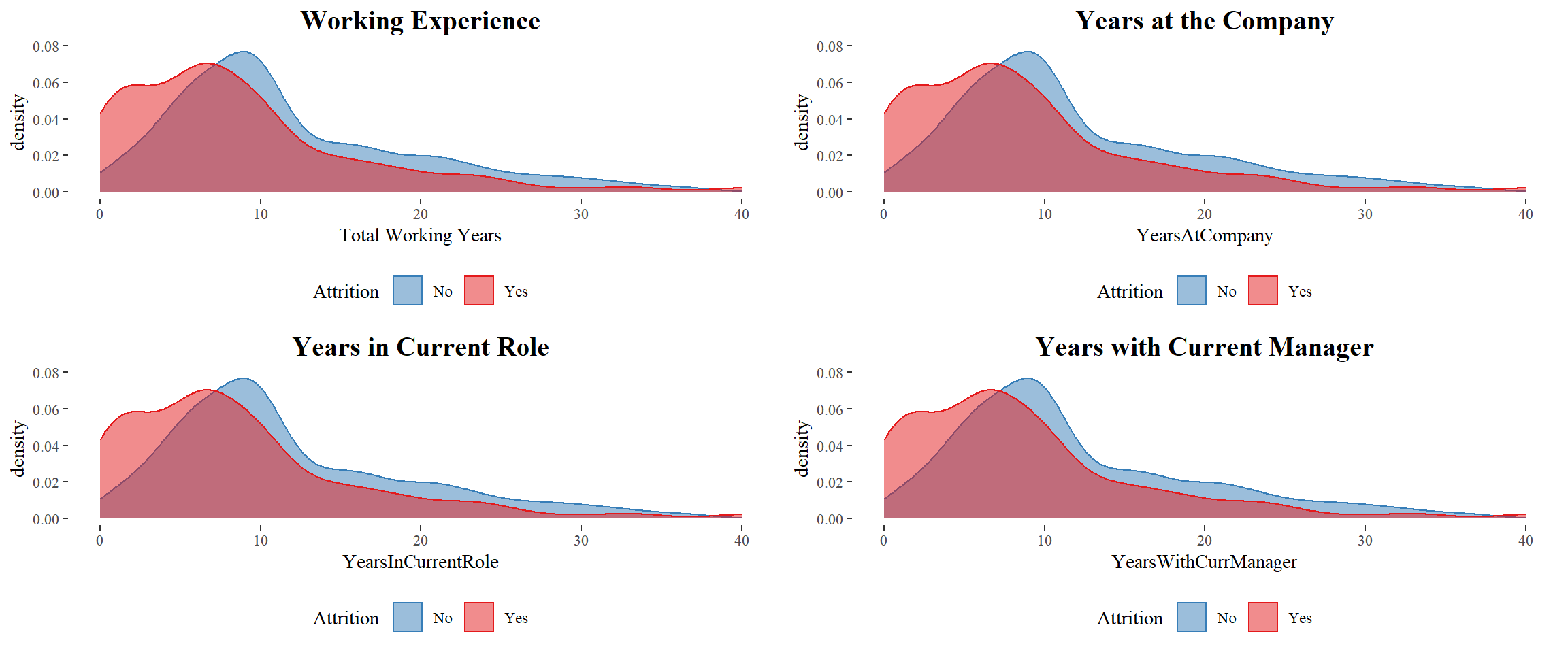
Time-Based Features
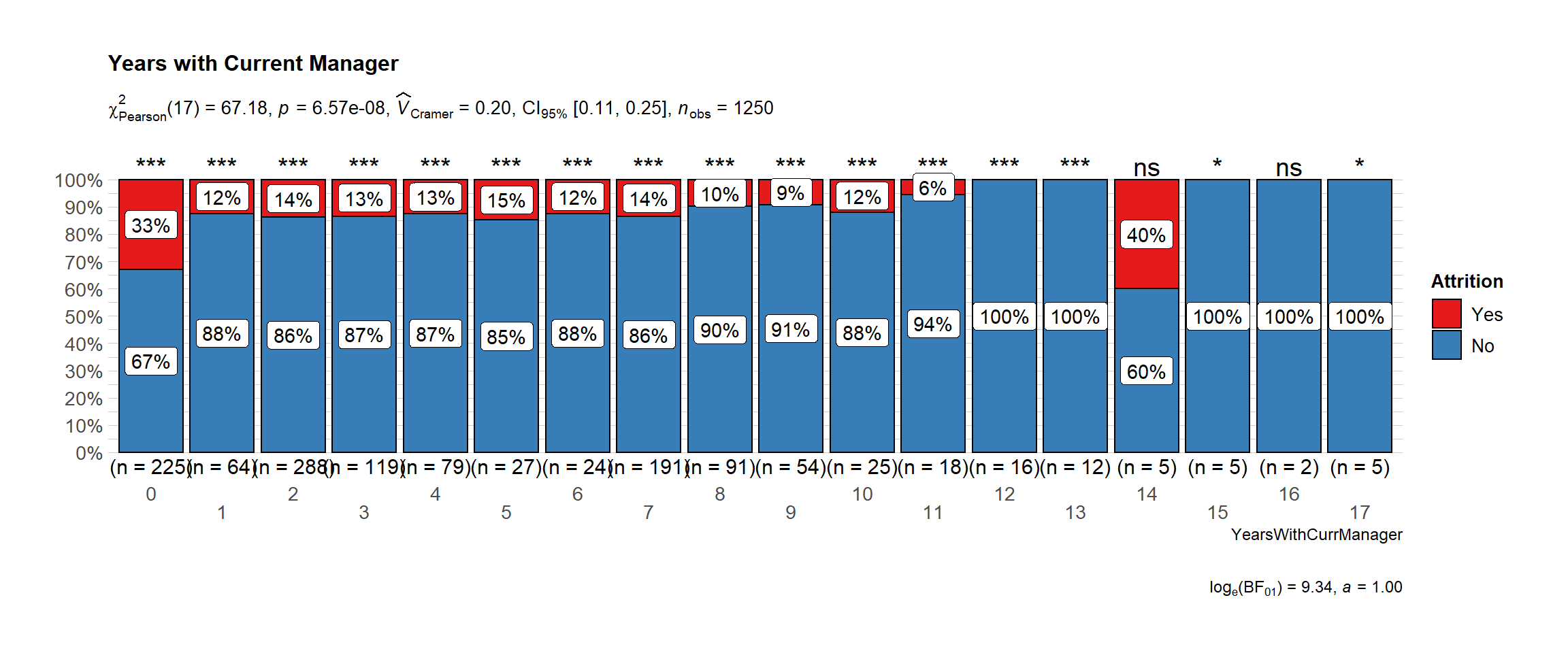
Work Experience
It seems to a large majority of those who left had a relatively shorter working years. The employees with less than 10 years of experience prefer to move to another company.
Findings:
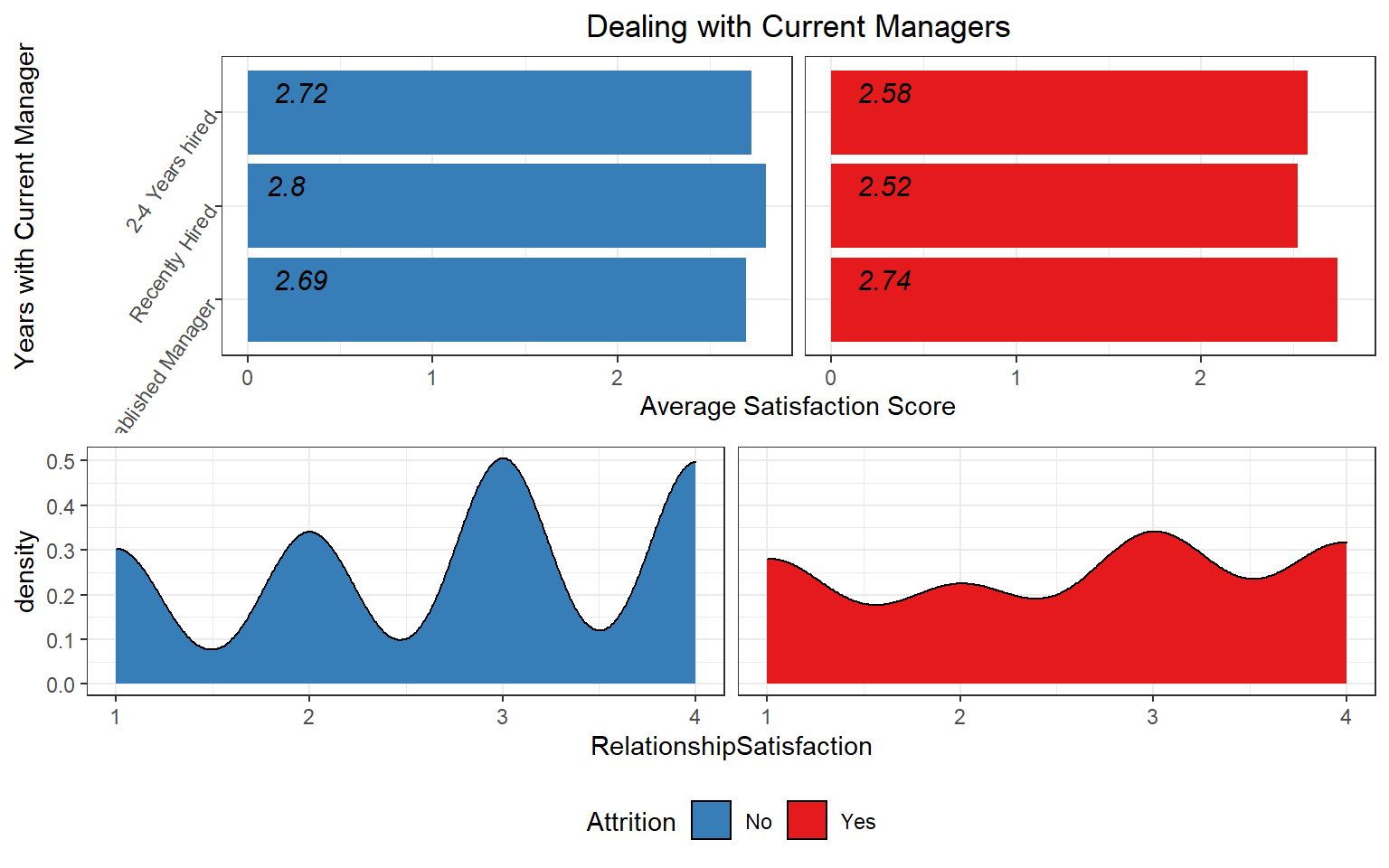
- Managers: Employees that are dealing with recently hired managers have a lower satisfaction score than managers that have been there for a longer time.
- Working Environment: As expected, managers and healthcare representatives are dealing with a lower working environment however, we don’t see the same with sales representatives that could be because most sales representatives work outside the organization.
# plot
ggbarstats(
  data = train_raw_tbl,
  x = "Attrition",
  y = "YearsWithCurrManager",
  sampling.plan = "jointMulti",
  title = "Years with Current Manager",
  # xlab = "",
  # legend.title = "",
  ggtheme = hrbrthemes::theme_ipsum_pub(),
  ggplot.component = list(scale_x_discrete(guide = guide_axis(n.dodge = 2))),
  palette = "Set1",
  messages = FALSE
      )
Current Managers and Average Satisfaction Score
Generation
What is the average number of companies previously worked for each generation? My aim is to see if it is true that past generations used to stay longer in one company.
Employees who quit the organization: For these type of employees we see that the boomers had a higher number of companies previously worked at.
Millenials: Most millenials are still relatively young, so that explains why the number of companies for millennials is relatively low however, I expect this number to increase as the years pass by.
Attrition by Generation: It seems that millennial are the ones with the highest turnover rate, followed by the boomers. What does this tell us? The newer generation which are the millennial opt to look more easy for other jobs that satisfy the needs on the other side we have the boomers which are approximating retirement and could be one of the reasons why the turnover rate of boomers is the second highest.
Understanding Generational Behavior: Distribution of number of companies worked by attrition and age. We want to see if young people have worked in more companies than the older generation. This might prove that the millenials tend to be more picky with regards to jobs than the older generation.
# First we must create categoricals variables based on Age
train_raw_tbl$Generation <- ifelse(train_raw_tbl$Age<37,"Millenials",
                        ifelse(train_raw_tbl$Age>=38 & train_raw_tbl$Age<54,"Generation X",
                               ifelse(train_raw_tbl$Age>=54 & train_raw_tbl$Age<73,"Boomers","Silent")))


# Let's see the distribution by generation now
generation.dist <- train_raw_tbl %>%
  select(Generation, NumCompaniesWorked, Attrition) %>%
  ggplot() +
  geom_boxplot(aes(x=reorder(Generation, NumCompaniesWorked, FUN=median), y=NumCompaniesWorked, fill=Generation)) +
  theme_tufte() + facet_wrap(~Attrition) +
  scale_fill_brewer(palette="RdBu") + coord_flip() +
  labs(title="Knowing Past Generations",x="Generation", y="Number of Companies Previously Worked") +
  theme(legend.position="bottom", legend.background = element_rect(fill="#FFFFFF",size=0.5, linetype="solid", colour ="black")) +
  theme(strip.background = element_blank(),
        strip.text.x = element_blank(),
        plot.title= element_text(hjust=0.5, color="black"),
        plot.background=element_rect(fill="#f2f2f2"),
        axis.text.x=element_text(colour="black"),
        axis.text.y=element_text(colour="black"),
        axis.title=element_text(colour="black"))


overall.avg <- train_raw_tbl %>%
  select(Generation, NumCompaniesWorked) %>%
  summarize(avg_ov=mean(NumCompaniesWorked))

# Let's find the average numbers of companies worked by generation
avg.comp <- train_raw_tbl %>%
  select(Generation, NumCompaniesWorked, Attrition) %>%
  group_by(Generation, Attrition) %>%
  summarize(avg=mean(NumCompaniesWorked)) %>%
  ggplot(aes(x=Generation, y=avg, color=Attrition)) +
  geom_point(size=4) + theme_tufte() +  # Draw points
  geom_segment(aes(x=Generation, xend=Generation, y=min(avg), yend=max(avg)), linetype="dashed", size=0.2, color="gray") +
  labs(title="",
       subtitle="Behavioral Difference between Generations",
       y="Average Number of Companies worked for",
       x="Generation") +
  coord_flip() +
  scale_color_manual(values=c("#58FA58", "#FA5858")) +
  theme(legend.position="bottom", legend.background = element_rect(fill="#FFFFFF", size=0.5, linetype="solid", colour ="black")) +
  theme(strip.background = element_blank(),
        strip.text.x = element_blank(),
        plot.title=element_text(hjust=0.5, color="black"),
        plot.subtitle=element_text(color="black"),
        plot.background=element_rect(fill="#f2f2f2"),
        axis.text.x=element_text(colour="black"),
        axis.text.y=element_text(colour="black"),
        axis.title=element_text(colour="black"))
plot_grid(generation.dist, avg.comp, nrow=2)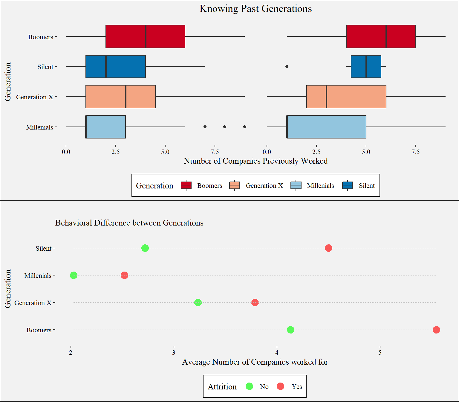
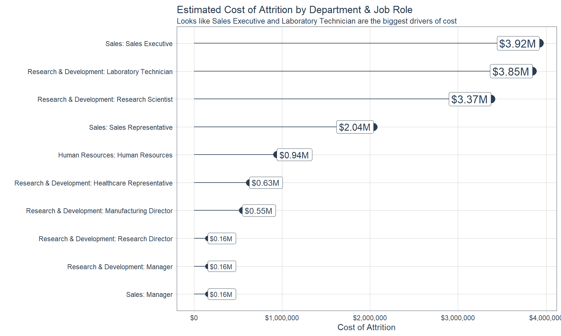
Cost of Attrition
Which Job Role has the highest total cost of attrition?
Data Preparation
Zero Variance Features
recipe_obj <- recipe(Attrition ~ ., data = train_readable_tbl) %>%
    step_zv(all_predictors())

recipe_obj
## Data Recipe
##
## Inputs:
##
## role #variables
## outcome 1
## predictor 34
##
## Operations:
##
## Zero variance filter on all_predictors()Transformation
Skewed Features
skewed_feature_names <- train_readable_tbl %>%
    select_if(is.numeric) %>%
    map_df(skewness) %>%
    gather(factor_key = T) %>%
    arrange(desc(value)) %>%
    filter(value >= 0.8) %>%
    filter(!key %in% c("JobLevel", "StockOptionLevel")) %>%
    pull(key) %>%
    as.character()

skewed_feature_names
## [1] "YearsSinceLastPromotion" "YearsAtCompany"
## [3] "MonthlyIncome" "TotalWorkingYears"
## [5] "NumCompaniesWorked" "DistanceFromHome"
## [7] "YearsInCurrentRole" "PercentSalaryHike"
## [9] "YearsWithCurrManager"train_readable_tbl %>%
select(skewed_feature_names) %>%
plot_hist_facet()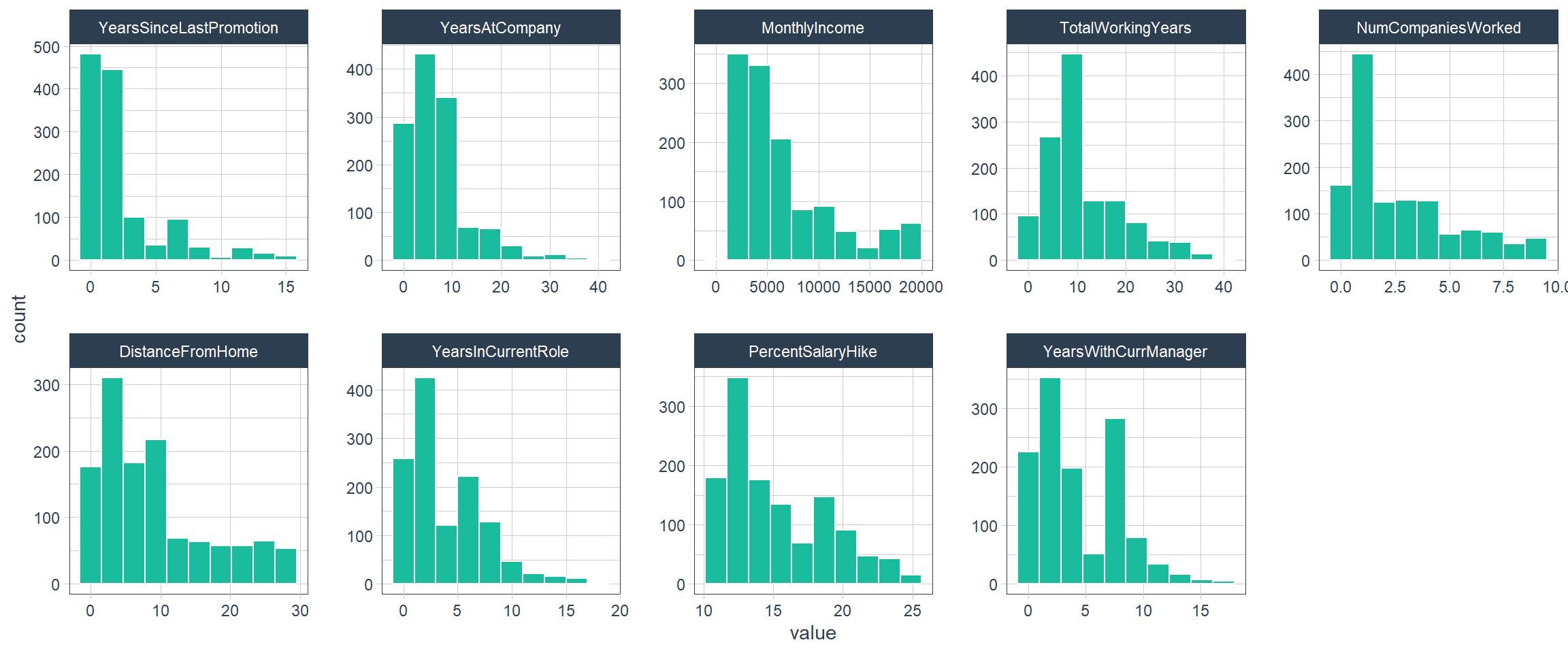
Transformed Features
factor_names <- c("JobLevel", "StockOptionLevel")

recipe_obj <- recipe(Attrition ~ ., data = train_readable_tbl) %>%
    step_zv(all_predictors()) %>%
    step_YeoJohnson(skewed_feature_names) %>%
    step_mutate_at(factor_names, fn = as.factor)

recipe_obj %>%
    prep() %>%
    bake(train_readable_tbl) %>%
    select(skewed_feature_names) %>%
    plot_hist_facet()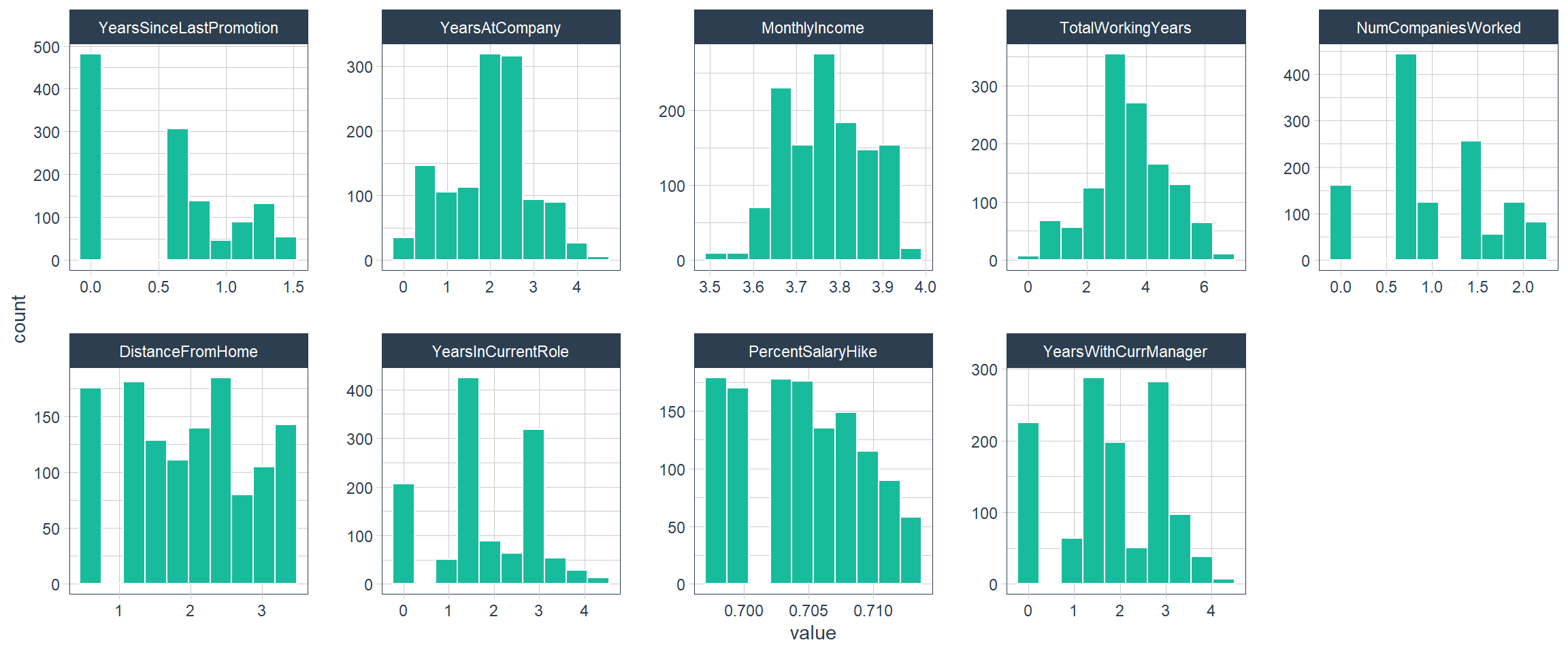
Center/Scaling
recipe_obj <- recipe(Attrition ~ ., data = train_readable_tbl) %>%
    step_zv(all_predictors()) %>%
    step_YeoJohnson(skewed_feature_names) %>%
    step_mutate_at(factor_names, fn = as.factor) %>%
    step_center(all_numeric()) %>%
    step_scale(all_numeric())

prepared_recipe <- recipe_obj %>% prep()
prepared_recipe %>%
    bake(new_data = train_readable_tbl) %>%
    select_if(is.numeric) %>%
    plot_hist_facet()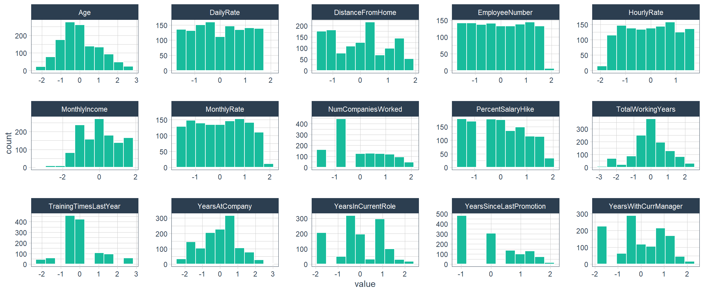
Dummy Variables
dummied_recipe_obj <- recipe(Attrition ~ ., data = train_readable_tbl) %>%
    step_zv(all_predictors()) %>%
    step_YeoJohnson(skewed_feature_names) %>%
    step_mutate_at(factor_names, fn = as.factor) %>%
    step_center(all_numeric()) %>%
    step_scale(all_numeric()) %>%
    step_dummy(all_nominal())

dummied_recipe_obj %>%
    prep() %>%
    bake(new_data = train_readable_tbl) %>%
    glimpse()
## Rows: 1,250
## Columns: 66
## $ Age <dbl> 0.445810757, 1.326511581, 0.0054...
## $ DailyRate <dbl> 0.74904690, -1.29050643, 1.42063...
## $ DistanceFromHome <dbl> -1.49654918, 0.26177716, -1.0235...
## $ EmployeeNumber <dbl> -1.701657, -1.699992, -1.696661,...
## $ HourlyRate <dbl> 1.39874138, -0.23947787, 1.29945...
## $ MonthlyIncome <dbl> 0.28123820, 0.04824053, -1.47034...
## $ MonthlyRate <dbl> 0.7331422, 1.5007180, -1.6825723...
## $ NumCompaniesWorked <dbl> 1.62470821, -0.58603051, 1.26983...
## $ PercentSalaryHike <dbl> -1.4812855, 1.6672467, 0.1960170...
## $ TotalWorkingYears <dbl> -0.26400582, 0.03531548, -0.4317...
## $ TrainingTimesLastYear <dbl> -2.1773654, 0.1442497, 0.1442497...
## $ YearsAtCompany <dbl> 0.12937107, 0.74947123, -2.24601...
## $ YearsInCurrentRole <dbl> 0.20272226, 0.87516459, -1.59511...
## $ YearsSinceLastPromotion <dbl> -1.11029069, 0.07030875, -1.1102...
## $ YearsWithCurrManager <dbl> 0.47708525, 0.89609325, -1.54446...
## $ BusinessTravel_Travel_Rarely <dbl> 1, 0, 1, 0, 1, 0, 1, 1, 0, 1, 1,...
## $ BusinessTravel_Travel_Frequently <dbl> 0, 1, 0, 1, 0, 1, 0, 0, 1, 0, 0,...
## $ Department_Research...Development <dbl> 0, 1, 1, 1, 1, 1, 1, 1, 1, 1, 1,...
## $ Department_Sales <dbl> 1, 0, 0, 0, 0, 0, 0, 0, 0, 0, 0,...
## $ Education_College <dbl> 1, 0, 1, 0, 0, 1, 0, 0, 0, 0, 0,...
## $ Education_Bachelor <dbl> 0, 0, 0, 0, 0, 0, 1, 0, 1, 1, 1,...
## $ Education_Master <dbl> 0, 0, 0, 1, 0, 0, 0, 0, 0, 0, 0,...
## $ Education_Doctor <dbl> 0, 0, 0, 0, 0, 0, 0, 0, 0, 0, 0,...
## $ EducationField_Life.Sciences <dbl> 1, 1, 0, 1, 0, 1, 0, 1, 1, 0, 0,...
## $ EducationField_Marketing <dbl> 0, 0, 0, 0, 0, 0, 0, 0, 0, 0, 0,...
## $ EducationField_Medical <dbl> 0, 0, 0, 0, 1, 0, 1, 0, 0, 1, 1,...
## $ EducationField_Other <dbl> 0, 0, 1, 0, 0, 0, 0, 0, 0, 0, 0,...
## $ EducationField_Technical.Degree <dbl> 0, 0, 0, 0, 0, 0, 0, 0, 0, 0, 0,...
## $ EnvironmentSatisfaction_Medium <dbl> 1, 0, 0, 0, 0, 0, 0, 0, 0, 0, 0,...
## $ EnvironmentSatisfaction_High <dbl> 0, 1, 0, 0, 0, 0, 1, 0, 0, 1, 0,...
## $ EnvironmentSatisfaction_Very.High <dbl> 0, 0, 1, 1, 0, 1, 0, 1, 1, 0, 0,...
## $ Gender_Male <dbl> 0, 1, 1, 0, 1, 1, 0, 1, 1, 1, 1,...
## $ JobInvolvement_Medium <dbl> 0, 1, 1, 0, 0, 0, 0, 0, 1, 0, 0,...
## $ JobInvolvement_High <dbl> 1, 0, 0, 1, 1, 1, 0, 1, 0, 1, 0,...
## $ JobInvolvement_Very.High <dbl> 0, 0, 0, 0, 0, 0, 1, 0, 0, 0, 1,...
## $ JobLevel_X2 <dbl> 1, 1, 0, 0, 0, 0, 0, 0, 0, 1, 0,...
## $ JobLevel_X3 <dbl> 0, 0, 0, 0, 0, 0, 0, 0, 1, 0, 0,...
## $ JobLevel_X4 <dbl> 0, 0, 0, 0, 0, 0, 0, 0, 0, 0, 0,...
## $ JobLevel_X5 <dbl> 0, 0, 0, 0, 0, 0, 0, 0, 0, 0, 0,...
## $ JobRole_Human.Resources <dbl> 0, 0, 0, 0, 0, 0, 0, 0, 0, 0, 0,...
## $ JobRole_Laboratory.Technician <dbl> 0, 0, 1, 0, 1, 1, 1, 1, 0, 0, 1,...
## $ JobRole_Manager <dbl> 0, 0, 0, 0, 0, 0, 0, 0, 0, 0, 0,...
## $ JobRole_Manufacturing.Director <dbl> 0, 0, 0, 0, 0, 0, 0, 0, 1, 0, 0,...
## $ JobRole_Research.Director <dbl> 0, 0, 0, 0, 0, 0, 0, 0, 0, 0, 0,...
## $ JobRole_Research.Scientist <dbl> 0, 1, 0, 1, 0, 0, 0, 0, 0, 0, 0,...
## $ JobRole_Sales.Executive <dbl> 1, 0, 0, 0, 0, 0, 0, 0, 0, 0, 0,...
## $ JobRole_Sales.Representative <dbl> 0, 0, 0, 0, 0, 0, 0, 0, 0, 0, 0,...
## $ JobSatisfaction_Medium <dbl> 0, 1, 0, 0, 1, 0, 0, 0, 0, 0, 1,...
## $ JobSatisfaction_High <dbl> 0, 0, 1, 1, 0, 0, 0, 1, 1, 1, 0,...
## $ JobSatisfaction_Very.High <dbl> 1, 0, 0, 0, 0, 1, 0, 0, 0, 0, 0,...
## $ MaritalStatus_Married <dbl> 0, 1, 0, 1, 1, 0, 1, 0, 0, 1, 1,...
## $ MaritalStatus_Divorced <dbl> 0, 0, 0, 0, 0, 0, 0, 1, 0, 0, 0,...
## $ OverTime_Yes <dbl> 1, 0, 1, 1, 0, 0, 1, 0, 0, 0, 0,...
## $ PerformanceRating_Good <dbl> 0, 0, 0, 0, 0, 0, 0, 0, 0, 0, 0,...
## $ PerformanceRating_Excellent <dbl> 1, 0, 1, 1, 1, 1, 0, 0, 0, 1, 1,...
## $ PerformanceRating_Outstanding <dbl> 0, 1, 0, 0, 0, 0, 1, 1, 1, 0, 0,...
## $ RelationshipSatisfaction_Medium <dbl> 0, 0, 1, 0, 0, 0, 0, 1, 1, 1, 0,...
## $ RelationshipSatisfaction_High <dbl> 0, 0, 0, 1, 0, 1, 0, 0, 0, 0, 1,...
## $ RelationshipSatisfaction_Very.High <dbl> 0, 1, 0, 0, 1, 0, 0, 0, 0, 0, 0,...
## $ StockOptionLevel_X1 <dbl> 0, 1, 0, 0, 1, 0, 0, 1, 0, 0, 1,...
## $ StockOptionLevel_X2 <dbl> 0, 0, 0, 0, 0, 0, 0, 0, 0, 1, 0,...
## $ StockOptionLevel_X3 <dbl> 0, 0, 0, 0, 0, 0, 1, 0, 0, 0, 0,...
## $ WorkLifeBalance_Good <dbl> 0, 0, 0, 0, 0, 1, 1, 0, 0, 1, 0,...
## $ WorkLifeBalance_Better <dbl> 0, 1, 1, 1, 1, 0, 0, 1, 1, 0, 1,...
## $ WorkLifeBalance_Best <dbl> 0, 0, 0, 0, 0, 0, 0, 0, 0, 0, 0,...
## $ Attrition_Yes <dbl> 1, 0, 1, 0, 0, 0, 0, 0, 0, 0, 0,...Final
recipe_obj <- recipe(Attrition ~ ., data = train_readable_tbl) %>%
    step_zv(all_predictors()) %>%
    step_YeoJohnson(skewed_feature_names) %>%
    step_mutate_at(factor_names, fn = as.factor) %>%
    step_center(all_numeric()) %>%
    step_scale(all_numeric()) %>%
    step_dummy(all_nominal()) %>%
    prep()

recipe_obj
## Data Recipe
##
## Inputs:
##
## role #variables
## outcome 1
## predictor 34
##
## Training data contained 1250 data points and no missing data.
##
## Operations:
##
## Zero variance filter removed EmployeeCount, Over18, StandardHours [trained]
## Yeo-Johnson transformation on 9 items [trained]
## Variable mutation for JobLevel, StockOptionLevel [trained]
## Centering for Age, DailyRate, ... [trained]
## Scaling for Age, DailyRate, ... [trained]
## Dummy variables from BusinessTravel, Department, Education, ... [trained]train_tbl <- bake(recipe_obj, new_data = train_readable_tbl)
test_tbl <- bake(recipe_obj, new_data = test_readable_tbl)Correlation
## # A tibble: 65 x 2
## feature Attrition_Yes
## <fct> <dbl>
## 1 PerformanceRating_Good NA
## 2 OverTime_Yes 0.240
## 3 JobRole_Sales.Representative 0.153
## 4 BusinessTravel_Travel_Frequently 0.103
## 5 Department_Sales 0.0891
## 6 DistanceFromHome 0.0822
## 7 JobRole_Laboratory.Technician 0.0737
## 8 EducationField_Technical.Degree 0.0731
## 9 JobRole_Human.Resources 0.0718
## 10 JobInvolvement_Medium 0.0604
## # ... with 55 more rowsDescriptive features:
Age, Gender, and Marital status
train_tbl %>%
select(Attrition_Yes, Age, contains("Gender"),
contains("MaritalStatus"), NumCompaniesWorked,
contains("Over18"), DistanceFromHome) %>%
plot_cor(target = Attrition_Yes, fct_reorder = T, fct_rev = F)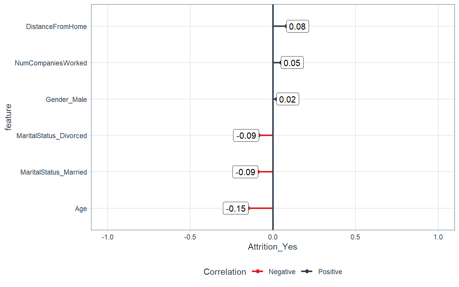
Employment features:
Department, Job role, and Job level
train_tbl %>%
select(Attrition_Yes, contains("employee"), contains("department"), contains("job")) %>%
plot_cor(target = Attrition_Yes, fct_reorder = F, fct_rev = F)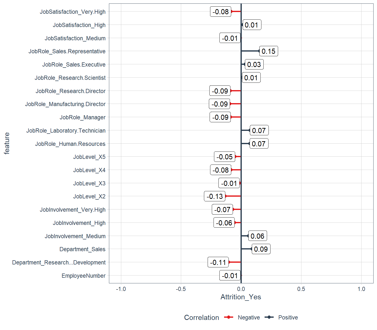
Compensation features:
Hourly rate, Monthly income, and Stock-option level
train_tbl %>%
select(Attrition_Yes, contains("income"), contains("rate"), contains("salary"), contains("stock")) %>%
plot_cor(target = Attrition_Yes, fct_reorder = F, fct_rev = F)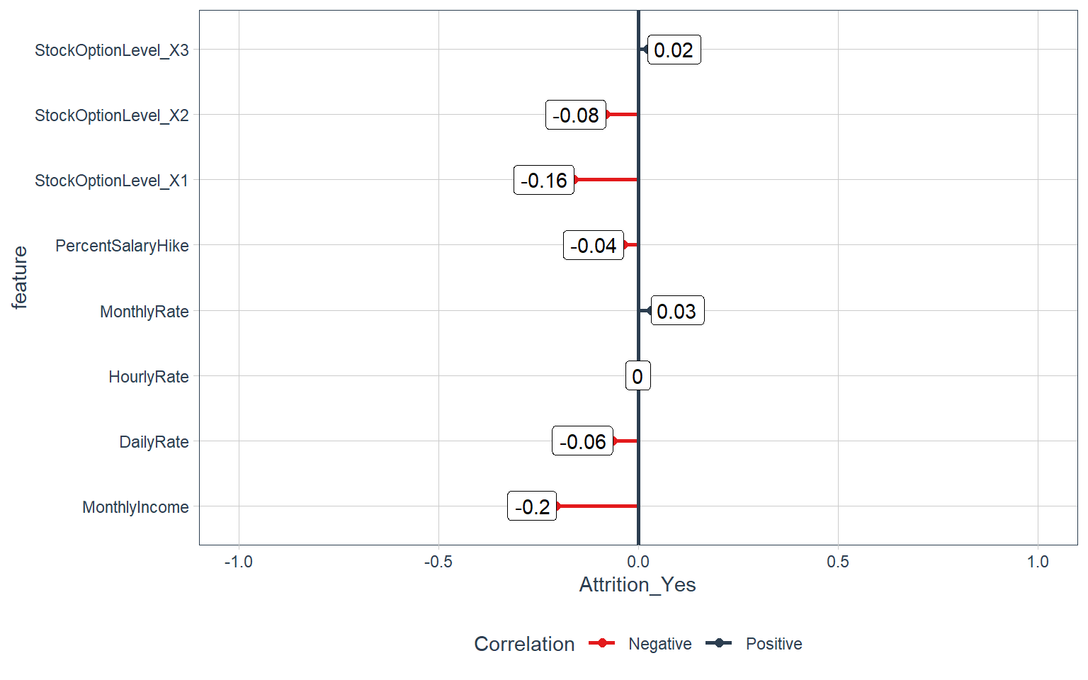
Survey Results:
Satisfaction level and Worklife balance
train_tbl %>%
select(Attrition_Yes, contains("satisfaction"), contains("life")) %>%
plot_cor(target = Attrition_Yes, fct_reorder = F, fct_rev = F)
Performance Data:
Job involvment and Performance rating
train_tbl %>%
select(Attrition_Yes, contains("performance"), contains("involvement")) %>%
plot_cor(target = Attrition_Yes, fct_reorder = F, fct_rev = F)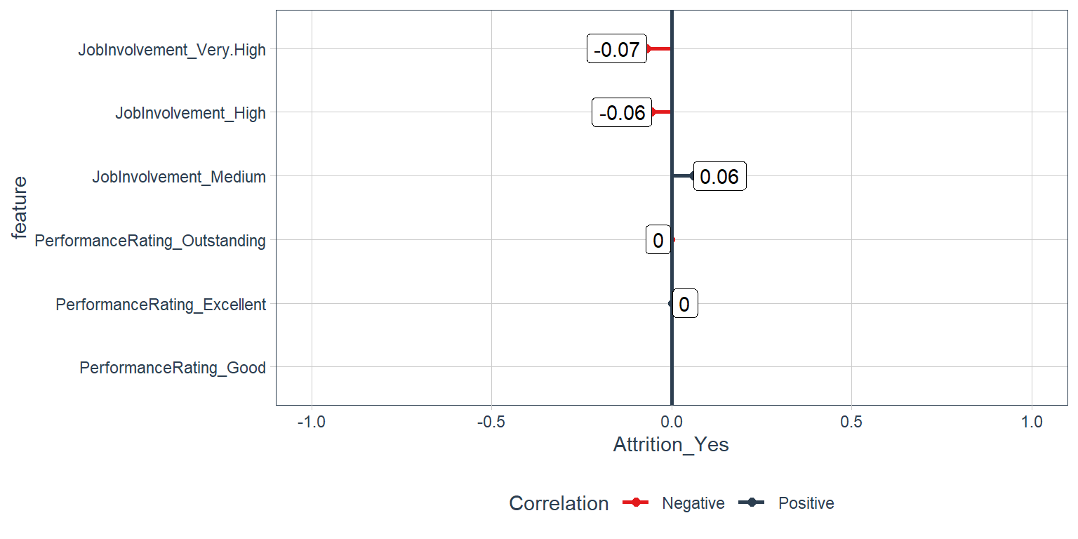
Overtime and Business Travel
train_tbl %>%
select(Attrition_Yes, contains("overtime"), contains("travel")) %>%
plot_cor(target = Attrition_Yes, fct_reorder = F, fct_rev = F)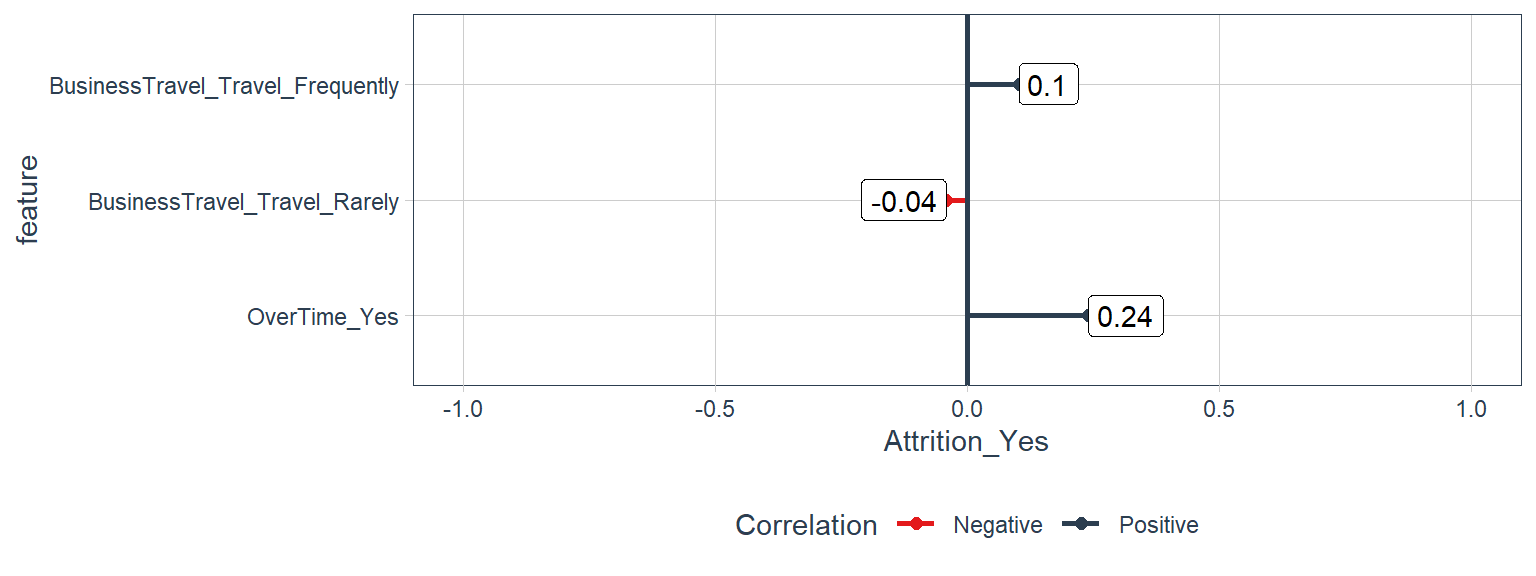
Training and Education
train_tbl %>%
select(Attrition_Yes, contains("training"), contains("education")) %>%
plot_cor(target = Attrition_Yes, fct_reorder = F, fct_rev = F)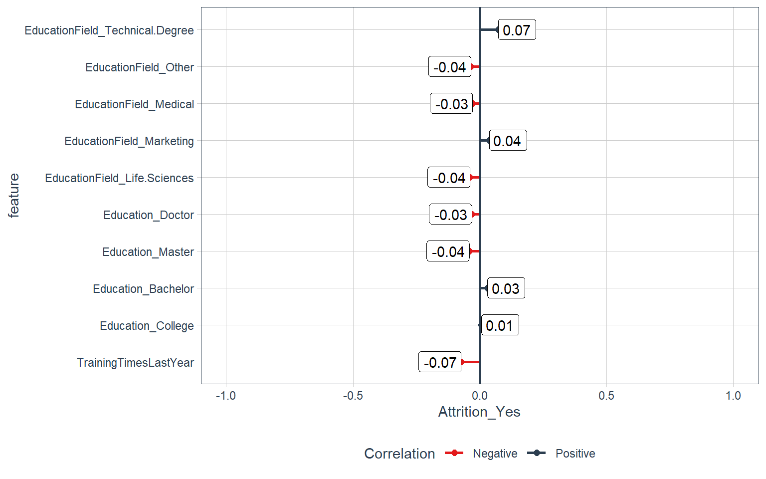
Time-Based Features:
Years at company and Years in current role
train_tbl %>%
select(Attrition_Yes, contains("years")) %>%
plot_cor(target = Attrition_Yes, fct_reorder = F, fct_rev = F)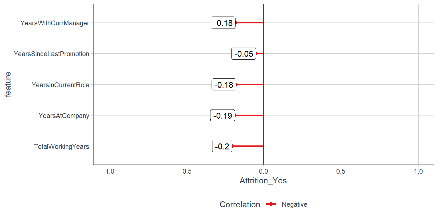
Modeling
Using Automated Machine Learning with H2o
H2o is a library that helps us implement the best machine learning models in order to come up with the most accurate predictions. What is really interesting about this library is that it does all the backend work for us that we normally do when implementing ML models. Maybe that’s why it is an automated machinelearning library? What things does H2o does for us here are some of the things that I have seen while using H2o.
- Cross-Validation: There is no need to worry about cross validation the automl function takes care of that.
- Parameter Optimization: H2o takes care of finding the most appropiate parameters in order to come up with the most accurate solution.
- Testing Different Models: H2o uses different models to come up with the most accurate solution.
recipe_obj <- recipe(Attrition ~ ., data = train_readable_tbl) %>%
step_zv(all_predictors()) %>%
step_YeoJohnson(all_of(skewed_feature_names)) %>%
step_num2factor(JobLevel, levels = c('1', '2', '3', '4', '5')) %>%
step_num2factor(StockOptionLevel, levels = c('0', '1', '2', '3'), transform = function(x) {x + 1}) %>%
step_center(all_numeric()) %>%
step_scale(all_numeric()) %>%
prep()
train_tbl <- bake(recipe_obj, new_data = train_readable_tbl)
test_tbl <- bake(recipe_obj, new_data = test_readable_tbl)Key Concepts
- Training Frame : Used to develop model.
- Validation Frame : Used to tune hyperparameters via grid search.
- Leaderboard Frame: Test set completely held out from model training & tuning.
- Use
max_run_time_secsto minimize modeling time initially. Once results look promising. - increase the run time to get more models with highly tuned parameters.
First, we need to initialize the Java Virtual Machine (JVM) that H2O uses locally.
h2o.init()Next, we change our data to an h2o object that the package can interpret. We also split the data into training, validation, and test sets.
split_h2o <- train_tbl %>%
  # Putting the original dataframe into an h2o format.
  as.h2o() %>%
  # Splitting into training, validation and testing sets.
  h2o.splitFrame(ratios = c(0.85), seed = 1234)

# Obtaining our three types of sets into three separate values.
train_h2o <- split_h2o[[1]]
valid_h2o <- split_h2o[[2]]
test_h2o  <- test_tbl %>% as.h2o()
Now we are ready to model. We’ll set the target and feature names. The target is what we aim to predict (in our case “Attrition”). The features (every other column) are what we will use to model the prediction.
# Set names for h2o
y <- "Attrition"
x <- setdiff(names(train_h2o), y)- x = x: The names of our feature columns.
- y = y: The name of our target column.
- training_frame = train_h2o: Training set consisting of 85% of the data.
- leaderboard_frame = valid_h2o: Validation set. H2O uses this to ensure the model does not overfit the data.
- max_runtime_secs = 50: This is to speed up H2O’s modeling. The algorithm has a large number of complex models so we want to keep things moving at the expense of some accuracy.
# Run the automated machine learning
automl_models_h20 <- h2o.automl(
    x = x,
    y = y,
    training_frame = train_h2o,
    validation_frame = valid_h2o,
    leaderboard_frame = test_h2o,
    max_runtime_secs = 50,
    nfolds = 5,
    seed = 1234
)
##
|
| | 0%
## 10:38:56.110: User specified a validation frame with cross-validation still enabled. Please note that the models will still be validated using cross-validation only, the validation frame will be used to provide purely informative validation metrics on the trained models.
## 10:38:56.119: AutoML: XGBoost is not available; skipping it.
|
|============ | 18%
|
|====================== | 32%
|
|============================= | 42%
|
|====================================== | 55%
|
|=========================================== | 61%
|
|=============================================== | 67%
|
|============================================================ | 86%
|
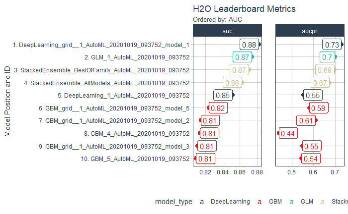
|======================================================================| 100%Check for the Top Models
All of the models are stored the automl_models_h2o object. However, we are only concerned with the leader, which is the best model in terms of accuracy on the validation set. We’ll extract it from the models object.
# Extract leader model
top_models <- automl_models_h20@leaderboard
top_models
## model_id auc logloss
## 1 DeepLearning_grid__1_AutoML_20201019_093752_model_1 0.8817935 0.3429199
## 2 GLM_1_AutoML_20201019_093752 0.8736413 0.2944945
## 3 StackedEnsemble_BestOfFamily_AutoML_20201019_093752 0.8701691 0.2892939
## 4 StackedEnsemble_AllModels_AutoML_20201019_093752 0.8621679 0.2957481
## 5 DeepLearning_1_AutoML_20201019_093752 0.8511473 0.3254789
## 6 GBM_grid__1_AutoML_20201019_093752_model_5 0.8236715 0.3370547
## aucpr mean_per_class_error rmse mse
## 1 0.7266964 0.2022947 0.2909960 0.08467864
## 2 0.6964766 0.1911232 0.2936914 0.08625463
## 3 0.6945204 0.2161836 0.2862594 0.08194444
## 4 0.6724754 0.1938406 0.2893229 0.08370772
## 5 0.5538139 0.2068237 0.3131429 0.09805846
## 6 0.5808377 0.2711353 0.3199102 0.10234256
##
## [18 rows x 7 columns]Visualize the H2O leaderboard to help with model selection.
# Visualize the H2O leaderboard to help with model selection.
plot_h2o_visualization <- function(
    h2o_leaderboard
    , order_by = c("auc","logloss","aucpr","mean_per_class_error","rmse","mse")
    , metrics_list = c("auc","logloss","aucpr","mean_per_class_error","rmse","mse")
    , n_max = 20
    , size = 4
    , include_lbl = TRUE
) {

    # Setup Inputs
    order_by     <- tolower(order_by[[1]])
    metrics_list <- tolower(metrics_list)

    leaderboard_tbl <- h2o_leaderboard %>%
        as_tibble() %>%
        mutate(model_type = str_split(model_id, "_", simplify = TRUE)[, 1]) %>%
        rownames_to_column(var = "rowname") %>%
        mutate(model_id = paste0(
            rowname
            , ". "
            , as.character(model_id)
            )
            %>% as.factor()
        ) %>%
        select(rowname, model_id, model_type, all_of(metrics_list), all_of(order_by))

    # Transformation
    if(order_by == "auc") {

        data_transformed_tbl <- leaderboard_tbl %>%
            slice(1:n_max) %>%
            mutate(
                model_id = as_factor(model_id) %>%
                    fct_reorder(auc)
                , model_type = as.factor(model_type)
            ) %>%
            pivot_longer(
                cols = c(-model_id, -model_type, -rowname)
                , names_to = "key"
                , values_to = "value"
                , names_ptypes = list(key = factor())
            )

    } else if (order_by == "logloss") {
        data_transformed_tbl <- leaderboard_tbl %>%
            slice(1:n_max) %>%
            mutate(
                model_id = as_factor(model_id) %>%
                    fct_reorder(logloss) %>%
                    fct_rev()
                , model_type = as.factor(model_type)
            ) %>%
            pivot_longer(
                cols = c(-model_id, -model_type, -rowname)
                , names_to = "key"
                , values_to = "value"
                , names_ptypes = list(key = factor())
            )
    } else {
        stop(paste0("order_by = '", order_by, " is not currently supported. Use auc or logloss"))
    }

    # Viz
    g <- data_transformed_tbl %>%
        ggplot(
            aes(
                x = value
                , y = model_id
                , color = model_type
            )
        ) +
        geom_point(size = size) +
        facet_wrap(~ key, scales = "free_x") +
        theme_tq() +
        scale_color_tq() +
        labs(
            title = "H2O Leaderboard Metrics"
            , subtitle = paste0("Ordered by: ", toupper(order_by))
            , y = "Model Position and ID"
            , x = ""
        )

    if(include_lbl) g <- g +
            geom_label(
                aes(
                    label = round(value, 2)
                    , hjust = "inward"
                )
            )

    return(g)
}


plot_h2o_visualization(
    automl_models_h20@leaderboard
    , order_by = c("auc")
    , metrics_list = c("auc","aucpr")
    , size = 3
    , n_max = 10
)
Top 3 Models
deep_learning_model <- h2o.loadModel("04_Modeling/h2o_models/DeepLearning_grid__1_AutoML_20201019_093752_model_1")
glm_model <- h2o.loadModel("04_Modeling/h2o_models/GLM_1_AutoML_20201019_093752")
stacked_ensemble_model <- h2o.loadModel("04_Modeling/h2o_models/StackedEnsemble_BestOfFamily_AutoML_20201019_093752")
Prediction
Now we are ready to predict on our test set, which is unseen from during our modeling process. This is the true test of performance. We use the h2o.predict() function to make predictions.
prediction <- h2o.predict(
    stacked_ensemble_model, # stacked_ensemble_model
    newdata = as.h2o(test_tbl)
)
# Saving it as a tibble
prediction_tbl <- prediction %>% as_tibble()
prediction_tbl## # A tibble: 220 x 3
## predict No Yes
## <fct> <dbl> <dbl>
## 1 No 0.958 0.0421
## 2 No 0.936 0.0641
## 3 No 0.961 0.0387
## 4 No 0.954 0.0461
## 5 Yes 0.246 0.754
## 6 No 0.909 0.0908
## 7 No 0.948 0.0520
## 8 No 0.961 0.0393
## 9 No 0.961 0.0388
## 10 No 0.960 0.0396
## # ... with 210 more rowsPerformance
performance_Deep_Learning <- h2o.performance(deep_learning_model, newdata = test_h2o)
performance_glm_model <-  h2o.performance(glm_model, newdata = test_h2o)
performance_Stacked_Ensemble <- h2o.performance(stacked_ensemble_model, newdata = test_h2o)
Now we can evaluate our leader model. We’ll reformat the test set an add the predictions as column so we have the actual and prediction columns side-by-side.
# Prep for performance assessment
test_performance <- test_h2o %>%
    tibble::as_tibble() %>%
    select(Attrition) %>%
    add_column(pred = as.vector(prediction$predict)) %>%
    mutate_if(is.character, as.factor)
test_performance
## # A tibble: 220 x 2
## Attrition pred
## <fct> <fct>
## 1 No No
## 2 No No
## 3 No No
## 4 No No
## 5 Yes Yes
## 6 No No
## 7 No No
## 8 No No
## 9 No No
## 10 No No
## # ... with 210 more rowsConfusion Matrix
Deep Learning Model
DL_confusion_matrix <- h2o.confusionMatrix(performance_Deep_Learning)
DL_confusion_matrix
## Confusion Matrix (vertical: actual; across: predicted) for max f1 @ threshold = 0.181077154212971:
## No Yes Error Rate
## No 176 8 0.043478 =8/184
## Yes 13 23 0.361111 =13/36
## Totals 189 31 0.095455 =21/220GLM Model
GLM_confusion_matrix <- h2o.confusionMatrix(performance_glm_model)
GLM_confusion_matrix
## Confusion Matrix (vertical: actual; across: predicted) for max f1 @ threshold = 0.362922913018338:
## No Yes Error Rate
## No 175 9 0.048913 =9/184
## Yes 12 24 0.333333 =12/36
## Totals 187 33 0.095455 =21/220Stacked Ensemble Model
Stacked_confusion_matrix <- h2o.confusionMatrix(performance_Stacked_Ensemble)
Stacked_confusion_matrix
## Confusion Matrix (vertical: actual; across: predicted) for max f1 @ threshold = 0.392786867645924:
## No Yes Error Rate
## No 176 8 0.043478 =8/184
## Yes 14 22 0.388889 =14/36
## Totals 190 30 0.100000 =22/220What’s important to HR.
Precision is when the model predicts yes, how often is it actually yes. Recall (also true positive rate or specificity) is when the actual value is yes how often is the model correct.
Most HR groups would probably prefer to incorrectly classify folks not looking to quit as high potential of quiting rather than classify those that are likely to quit as not at risk. Because it’s important to not miss at risk employees, HR will really care about recall or when the actual value is Attrition = YES how often the model predicts YES.
Recall for our model is 67%. In an HR context, this is 67% more employees that could potentially be targeted prior to quiting. From that standpoint, an organization that loses 100 people per year could possibly target 67 implementing measures to retain.
# Performance analysis
tn <- GLM_confusion_matrix$No[1]
tp <- GLM_confusion_matrix$Yes[2]
fp <- GLM_confusion_matrix$Yes[1]
fn <- GLM_confusion_matrix$No[2]

accuracy <- (tp + tn) / (tp + tn + fp + fn)
misclassification_rate <- 1 - accuracy
recall <- tp / (tp + fn)
precision <- tp / (tp + fp)
null_error_rate <- tn / (tp + tn + fp + fn)

tibble(
    accuracy,
    misclassification_rate,
    recall,
    precision,
    null_error_rate
) %>%
    transpose()
## [[1]]
## [[1]]$accuracy
## [1] 0.9045455
##
## [[1]]$misclassification_rate
## [1] 0.09545455
##
## [[1]]$recall
## [1] 0.6666667
##
## [[1]]$precision
## [1] 0.7272727
##
## [[1]]$null_error_rate
## [1] 0.7954545Performance Diagnostic Dashboard
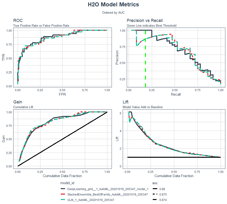
Containing an ROC Plot, Precision vs Recall Plot, Gain Plot, and Lift Plot
plot_h2o_performance <- function(
    h2o_leaderboard
    , newdata
    , order_by = c("auc","logloss")
    , max_models = 3
    , size = 1.5
) {

    # Inputs
    leaderboard_tbl <- h2o_leaderboard %>%
        as_tibble() %>%
        slice(1:max_models)

    newdata_tbl <- newdata %>%
        as_tibble()

    order_by <- tolower(order_by[[1]])
    order_by_expr <- rlang::sym(order_by)

    h2o.no_progress()

    # 1. Model Metrics ----
    get_model_performance_metrics <- function(model_id, test_tbl) {

        model_h2o <- h2o.getModel(model_id)
        perf_h2o <- h2o.performance(model_h2o, newdata = as.h2o(test_tbl))

        perf_h2o %>%
            h2o.metric() %>%
            as_tibble() %>%
            select(threshold, tpr, fpr, precision, recall)

    }

    model_metrics_tbl <- leaderboard_tbl %>%
        mutate(metrics = map(model_id, get_model_performance_metrics, newdata_tbl)) %>%
        unnest(metrics) %>%
        mutate(
            model_id = as_factor(model_id) %>%
                fct_reorder({{ order_by_expr }}, .desc = ifelse(order_by == "auc", TRUE, FALSE))
            , auc = auc %>%
                round(3) %>%
                as.character() %>%
                as_factor() %>%
                fct_reorder(as.numeric(model_id))
            , logloss = logloss %>%
                round(4) %>%
                as.character() %>%
                as_factor() %>%
                fct_reorder(as.numeric(model_id))
        )

    # 1A. ROC Plot ----
    p1 <- model_metrics_tbl %>%
        ggplot(
            mapping = aes_string(
                "fpr","tpr", color = "model_id", linetype = order_by
            )
        ) +
        geom_line(size = size) +
        theme_tq() +
        scale_color_tq() +
        labs(
            title = "ROC"
            , subtitle = "True Positive Rate vs False Positive Rate"
            , x = "FPR"
            , y = "TPR"
        ) +
        theme(legend.direction = "vertical")

    # 1B. Precision vs Recall ----
    p2 <- model_metrics_tbl %>%
        ggplot(
            mapping = aes_string(
                x = "recall"
                , y = "precision"
                , color = "model_id"
                , linetype = order_by
            )
        ) +
        geom_line(size = size) +
        geom_vline(
            xintercept = h2o.find_threshold_by_max_metric(performance_Deep_Learning, "f1")
            , color = "green"
            , size = size
            , linetype = "dashed"
        ) +
        theme_tq() +
        scale_color_tq() +
        labs(
            title = "Precision vs Recall"
            , subtitle = "Green Line indicates Best Threshold"
            , x = "Recall"
            , y = "Precision"
        ) +
        theme(legend.position = "none")

    # 2. Gain / Lift ----

    get_gain_lift <- function(model_id, test_tbl) {

        model_h2o <- h2o.getModel(model_id)
        perf_h2o <- h2o.performance(model_h2o, newdata = as.h2o(test_tbl))

        perf_h2o %>%
            h2o.gainsLift() %>%
            as_tibble() %>%
            select(group, cumulative_data_fraction, cumulative_capture_rate, cumulative_lift)

    }

    gain_lift_tbl <- leaderboard_tbl %>%
        mutate(metrics = map(model_id, get_gain_lift, newdata_tbl)) %>%
        unnest(metrics) %>%
        mutate(
            model_id = as_factor(model_id) %>%
                fct_reorder({{ order_by_expr }}, .desc = ifelse(order_by == "auc", TRUE, FALSE))
            , auc = auc %>%
                round(3) %>%
                as.character() %>%
                as_factor() %>%
                fct_reorder(as.numeric(model_id))
            , logloss = logloss %>%
                round(4) %>%
                as.character() %>%
                as_factor() %>%
                fct_reorder(as.numeric(model_id))
        ) %>%
        dplyr::rename(
            gain = cumulative_capture_rate
            , lift = cumulative_lift
        )

    # 2A. Gain Plot ----

    p3 <- gain_lift_tbl %>%
        ggplot(
            mapping = aes_string(
                x = "cumulative_data_fraction"
                , y = "gain"
                , color = "model_id"
                , linetype = order_by
            )
        ) +
        geom_line(size = size) +
        geom_segment(x = 0, y = 0, xend = 1, yend = 1, color = "black", size = size) +
        theme_tq() +
        scale_color_tq() +
        expand_limits(x = c(0,1), y = c(0,1)) +
        labs(
            title = "Gain"
            , subtitle = "Cumulative Lift"
            , x = "Cumulative Data Fraction"
            , y = "Gain"
        ) +
        theme(legend.position = "none")

    # 2B. Lift Plot ----

    p4 <- gain_lift_tbl %>%
        ggplot(
            mapping = aes_string(
                x = "cumulative_data_fraction"
                , y = "lift"
                , color = "model_id"
                , linetype = order_by
            )
        ) +
        geom_line(size = size) +
        geom_segment(x = 0, y = 1, xend = 1, yend = 1, color = "black", size = size) +
        theme_tq() +
        scale_color_tq() +
        expand_limits(x = c(0,1), y = c(0,1)) +
        labs(
            title = "Lift"
            , subtitle = "Model Value Add vs Baseline"
            , x = "Cumulative Data Fraction"
            , y = "Lift"
        ) +
        theme(legend.position = "none")

    # Combine using cowplot ----

    p_legend <- get_legend(p1)
    p1 <- p1 + theme(legend.position = "none")

    p <- cowplot::plot_grid(p1, p2, p3, p4, ncol = 2)

    p_title <- ggdraw() +
        draw_label(
            "H2O Model Metrics"
            , size = 18
            , fontface = "bold"
            , color = palette_light()[[1]]
        )

    p_subtitle <- ggdraw() +
        draw_label(
            glue("Ordered by {toupper(order_by)}")
            , size = 10
            , color = palette_light()[[1]]
        )

    ret <- plot_grid(
        p_title
        , p_subtitle
        , p
        , p_legend
        , ncol = 1
        , rel_heights = c(0.05, 0.05, 1, 0.05 * max_models)
    )

    h2o.show_progress()

    return(ret)

}

plot_h2o_performance(
    h2o_leaderboard = automl_models_h20@leaderboard
    , newdata = test_tbl
    , order_by = "auc"
    , max_models = 3
)
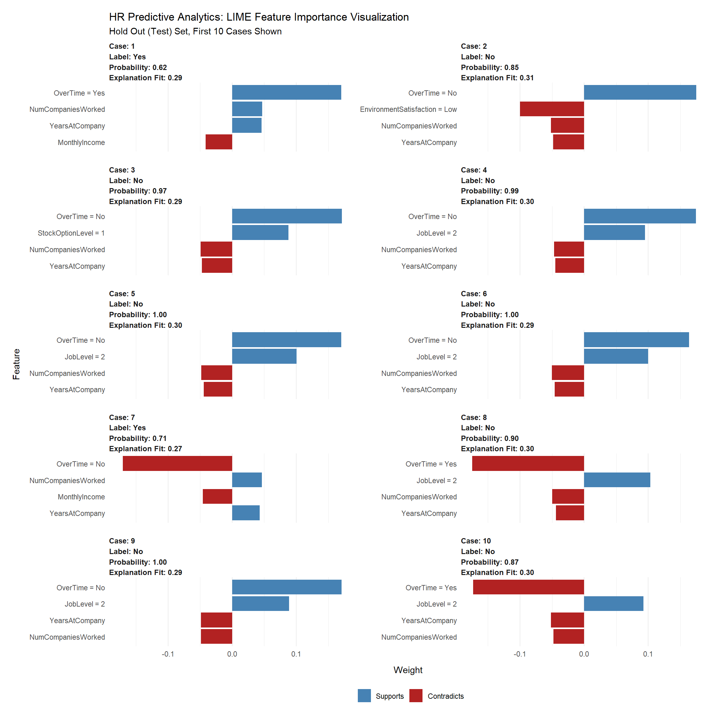
What causes attrition
Local Interpretable Model-agnostic Explanations (LIME) for Black-Box Model Explanation.
The machine learning model predicts the probability of someone leaving the company. This probability is then converted to a prediction of either leave or stay through a process called Binary Classification. However, this doesn’t solve the main objective, which is to make better decisions. It only tells us which employees are highest risk and therefore high probability. We can hone in on these individuals, but we need a different tool to understand why an individual is leaving.
Explanations are MORE CRITICAL to the business than PERFORMANCE. Think about it. What good is a high performance model that predicts employee attrition if we can’t tell what features are causing people to quit? We need explanations to improve business decision making. Not just performance.
The first thing we need to do is identify the class of our model leader object. We do this with the class() function.
class(glm_model)## [1] "H2OBinomialModel"
## attr(,"package")
## [1] "h2o"Next we create our model_type function. It’s only input is x the h2o model. The function simply returns “classification”, which tells LIME we are classifying.
# Setup lime::model_type() function for h2o
model_type.H2OBinomialModel <- function(x, ...) {
    # Function tells lime() what model type we are dealing with
    # 'classification', 'regression', 'survival', 'clustering', 'multilabel', etc
    #
    # x is our h2o model

    return("classification")
}
Now we can create our predict_model function. Inputs must be x a model, newdata a dataframe object and type which is not used but can be use to switch the output type. The output is a little tricky because it must be in the format of probabilities by classification.
# Setup lime::predict_model() function for h2o
predict_model.H2OBinomialModel <- function(x, newdata, type, ...) {
    # Function performs prediction and returns dataframe with Response
    #
    # x is h2o model
    # newdata is data frame
    # type is only setup for data frame

    pred <- h2o.predict(x, as.h2o(newdata))

    # return probs
    return(as.data.frame(pred[,-1]))

}
This will show you what the output looks like and to test our predict_model function. See how it’s the probabilities by classification. It must be in this form for model_type = “classification”.
# Test our predict_model() function
predict_model(x = glm_model, newdata = as.data.frame(test_h2o[,-1]), type = 'raw') %>%
    tibble::as_tibble()
##
|
| | 0%
|
|======================================================================| 100%
##
|
| | 0%
|
|======================================================================| 100%## # A tibble: 220 x 2
## No Yes
## <dbl> <dbl>
## 1 0.982 0.0178
## 2 0.921 0.0789
## 3 0.997 0.00258
## 4 0.970 0.0304
## 5 0.380 0.620
## 6 0.848 0.152
## 7 0.967 0.0330
## 8 0.991 0.00866
## 9 0.997 0.00269
## 10 0.997 0.00294
## # ... with 210 more rowsNow the fun part, we create an explainer using the lime() function. Just pass the training data set without the “Attribution column”. The form must be a data frame, which is OK since our predict_model function will switch it to an h2o object. Set model = models our leader model, and bin_continuous = FALSE. We could tell the algorithm to bin continuous variables, but this may not make sense for categorical numeric data that we didn’t change to factors.
# Run lime() on training set
explainer <- lime::lime(
    as.data.frame(train_h2o[,-1]),
    model = glm_model,
    bin_continuous = FALSE)
Now we run the explain() function, which returns our explanation. This can take a minute to run so we limit it to just the first ten rows of the test data set.
- n_labels = 1: Explaining a single class.
- n_features = 4: Returns the top four features that are critical to each case.
- kernel_width = 0.5: Allows us to increase the “model_r2” value by shrinking the localized evaluation.
# Run explain() on explainer
explanation <- lime::explain(
    as.data.frame(test_h2o[5:14,-1]),
    explainer = explainer,
    n_labels = 1,
    n_features = 4,
    kernel_width = 0.5)
##
|
| | 0%
|
|======================================================================| 100%
##
|
| | 0%
|
|======================================================================| 100%Feature Importance Visualization
The payoff for the work we put in using LIME is this feature importance plot. This allows us to visualize each of the ten cases (observations) from the test data. The top four features for each case are shown. Note that they are not the same for each case.
- The blue bars mean that the feature supports the model conclusion.
- The red bars contradict.
We’ll focus in on Cases with Label = Yes, which are predicted to have attrition. We can see a common theme with Case 1 and Case 7: Monthly income, Years at the company , No. of companies worked and Over Time are among the top factors influencing attrition.
plot_features(explanation) +
    labs(title = "HR Predictive Analytics: LIME Feature Importance Visualization",
         subtitle = "Hold Out (Test) Set, First 10 Cases Shown")